TopZone Product Page Redesign – Ecommerce Website UI/UX Case Study

The product detail page is an extremely important page; it determines whether customers will purchase your products or not. In this article, I will analyze the design issues of the product detail page of the TopZone website - a site selling Apple products in Vietnam.
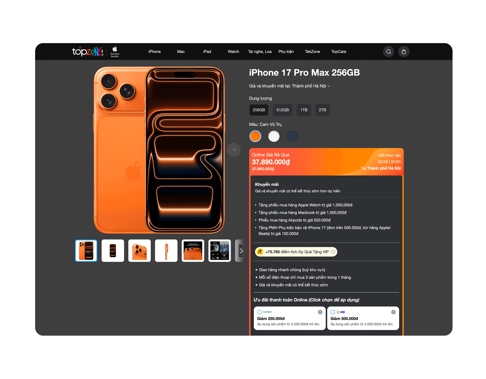
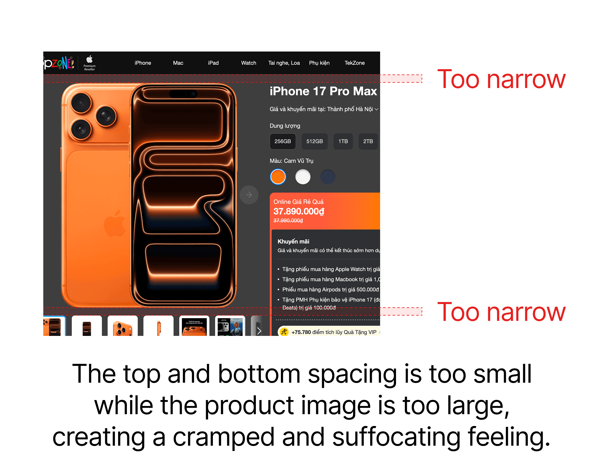
As you can see, the content and images are currently too close to the navigation, while the product image is overly large, creating a cramped and suffocating feeling that detracts from the website's premium feel.
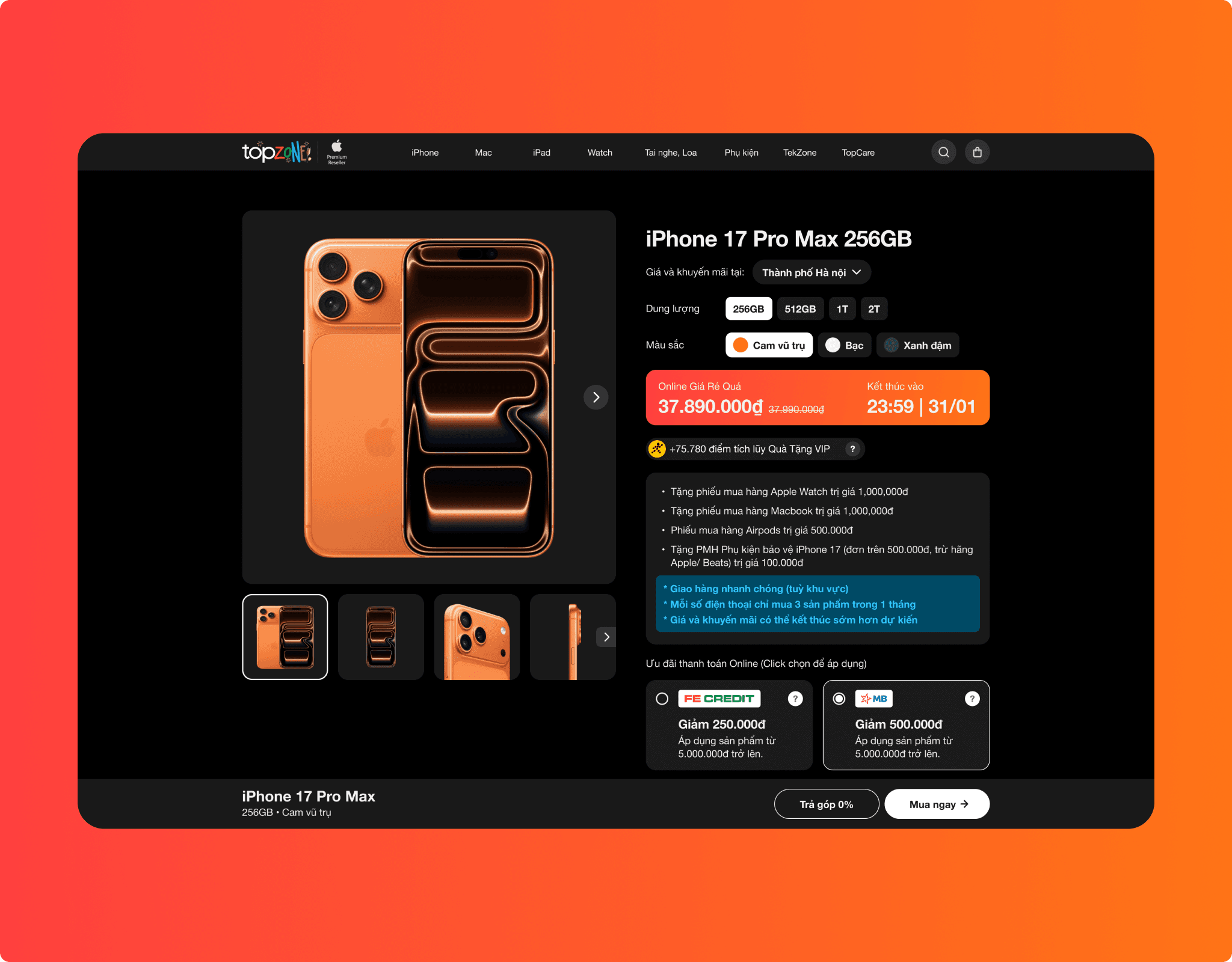
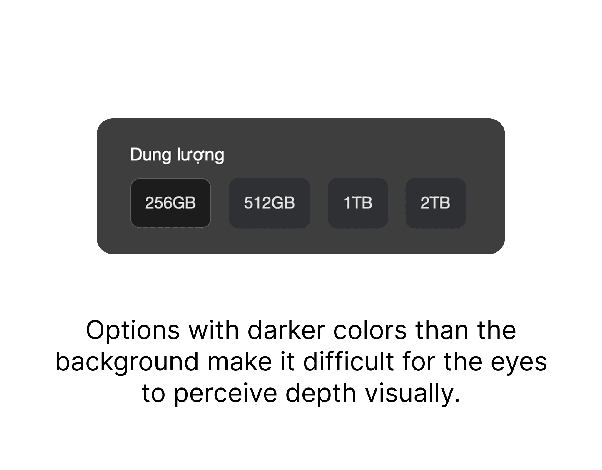
The product's storage options are displayed in a color that is brighter than the background, which diminishes the sense of depth in the Dark Mode interface design. Additionally, the 256GB option is not highlighted compared to the other options.
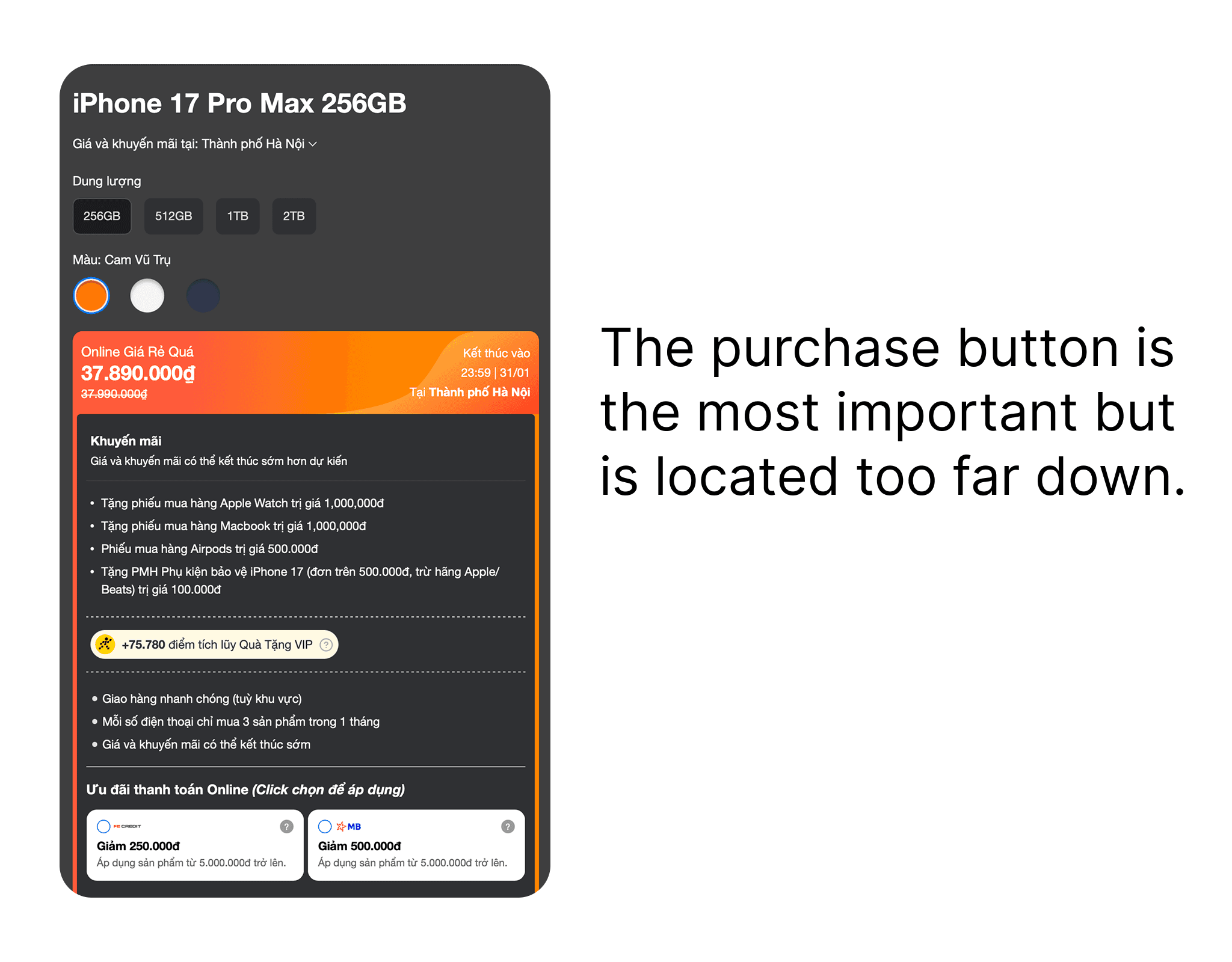
Product information and promotions are densely packed, while the purchase button is located deep below, making it difficult for users to make a purchase.
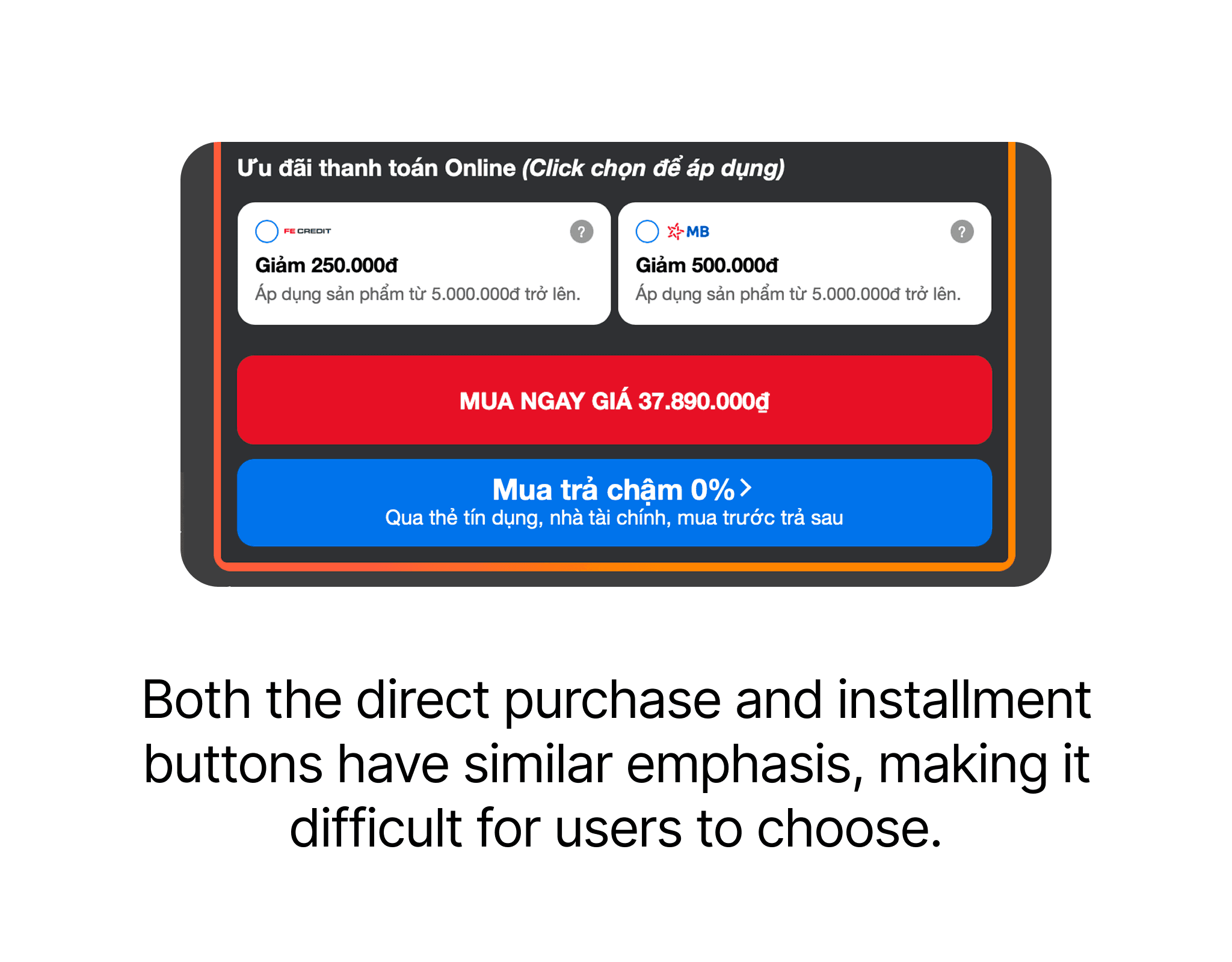
The "Buy Now" button and the "Buy in Installments" button are red and blue, respectively, which complicates the decision-making process for users since both buttons have equal emphasis and no action is prioritized.
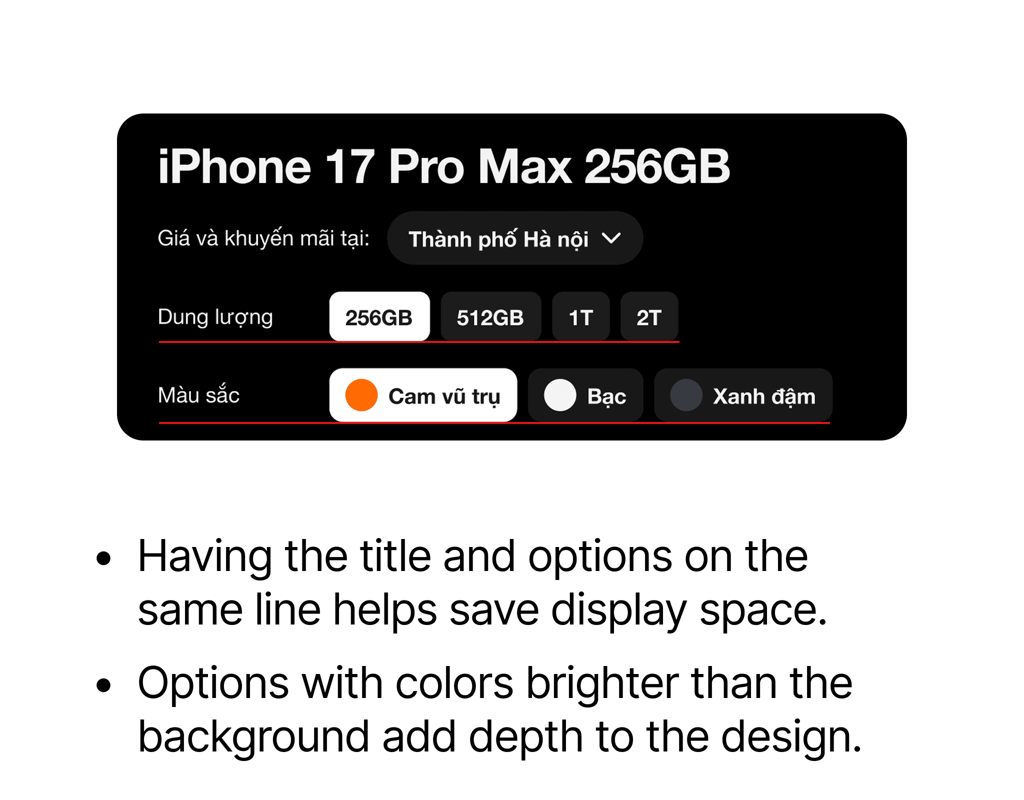
In the new design, I have arranged the title and options in the same row to save display space. Additionally, the options have a container that is brighter than the background, adding depth to the design, and the selected option is highlighted in white to help customers quickly recognize their choice.
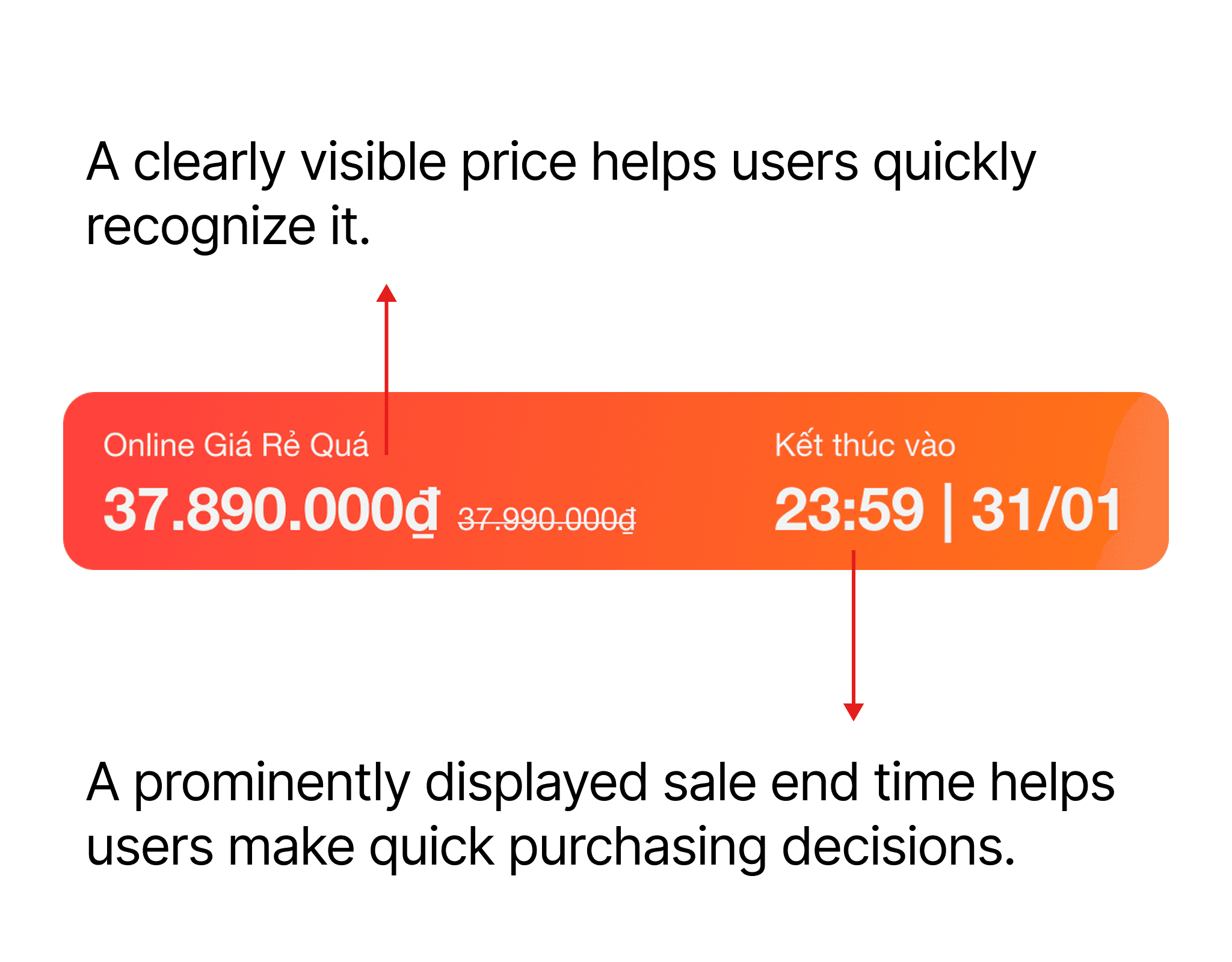
The price and promotion end time are displayed in large font to help customers easily recognize the product price and quickly make a purchasing decision.
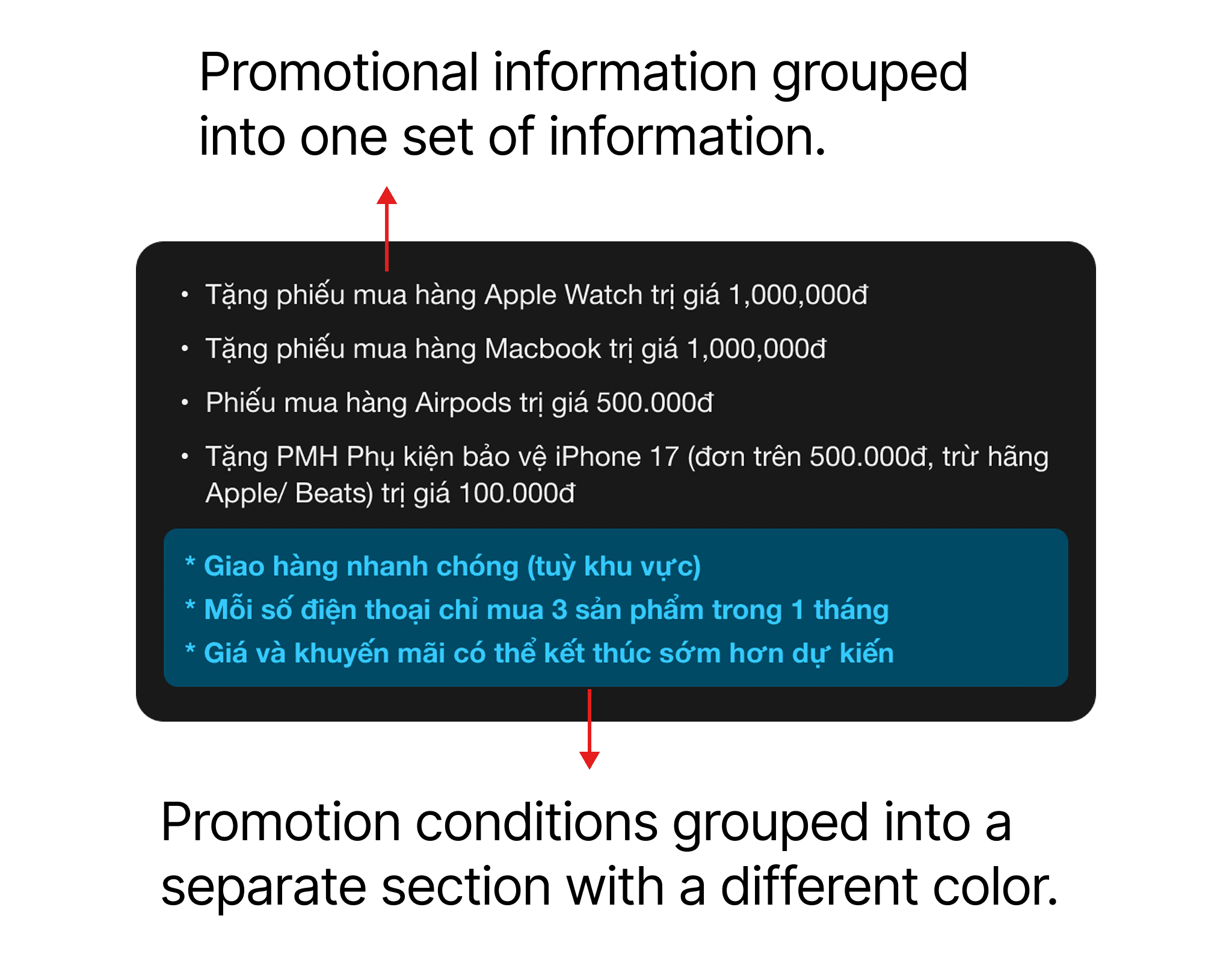
I have grouped the promotional information into one section and the promotion conditions into another with distinct colors to help customers quickly grasp the promotion program and applicable conditions without confusion.
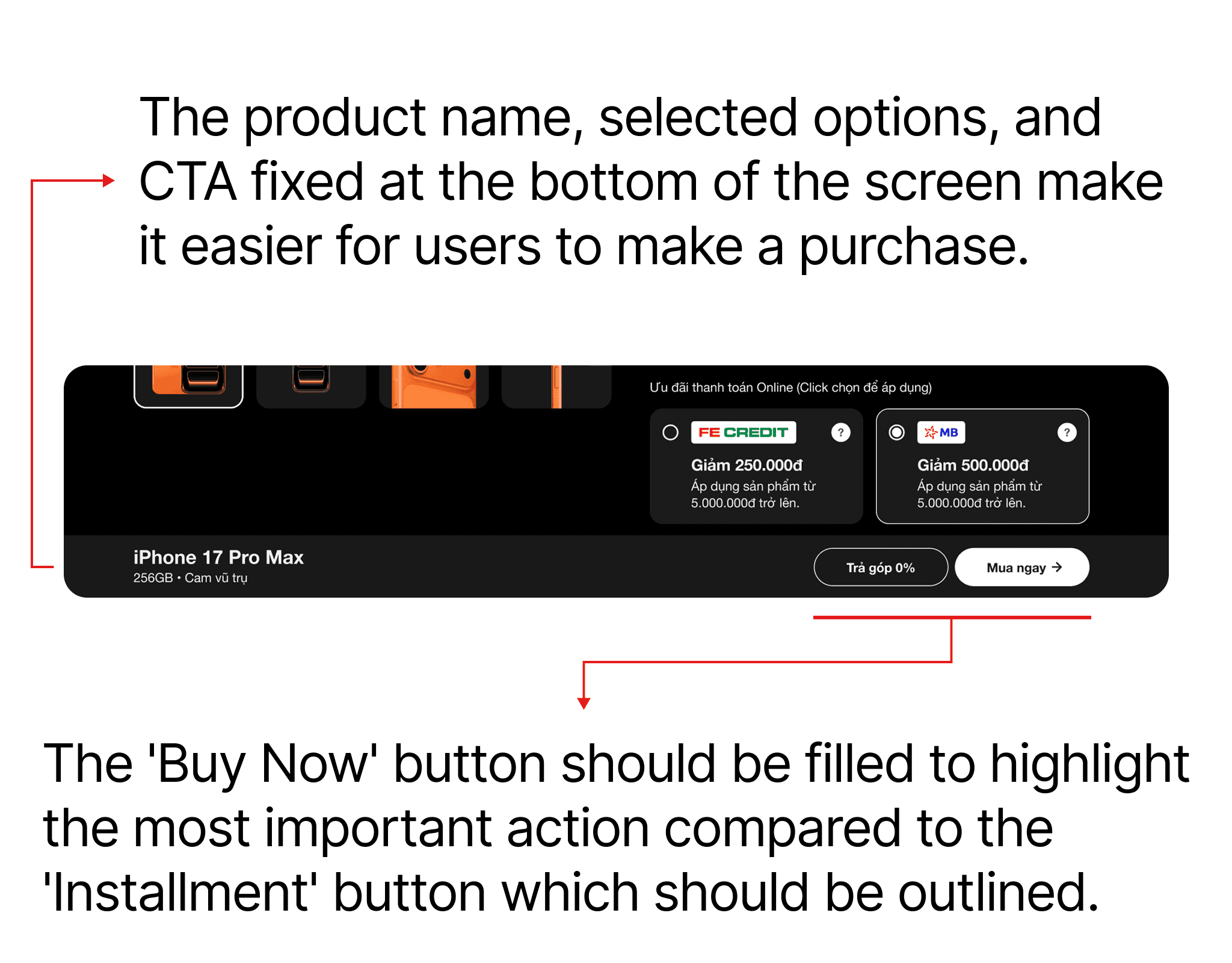
The product name, selected options, and CTA are fixed at the bottom of the screen, remaining in place while scrolling. This helps customers easily recognize their selected options and facilitates purchasing through either direct purchase or installment. The "Buy Now" button is filled, while the "0% Installment" button is outlined, emphasizing that the "Buy Now" button is the preferred action.
And here is the new design screen