Redesigning the shop screen of an e-commerce website: A UX case study

ShopeeFood is the leading food delivery platform in Vietnam; however, their website is designed quite poorly. In this article, I will analyze the shortcomings in the design of the Shop screen and how I addressed those issues.
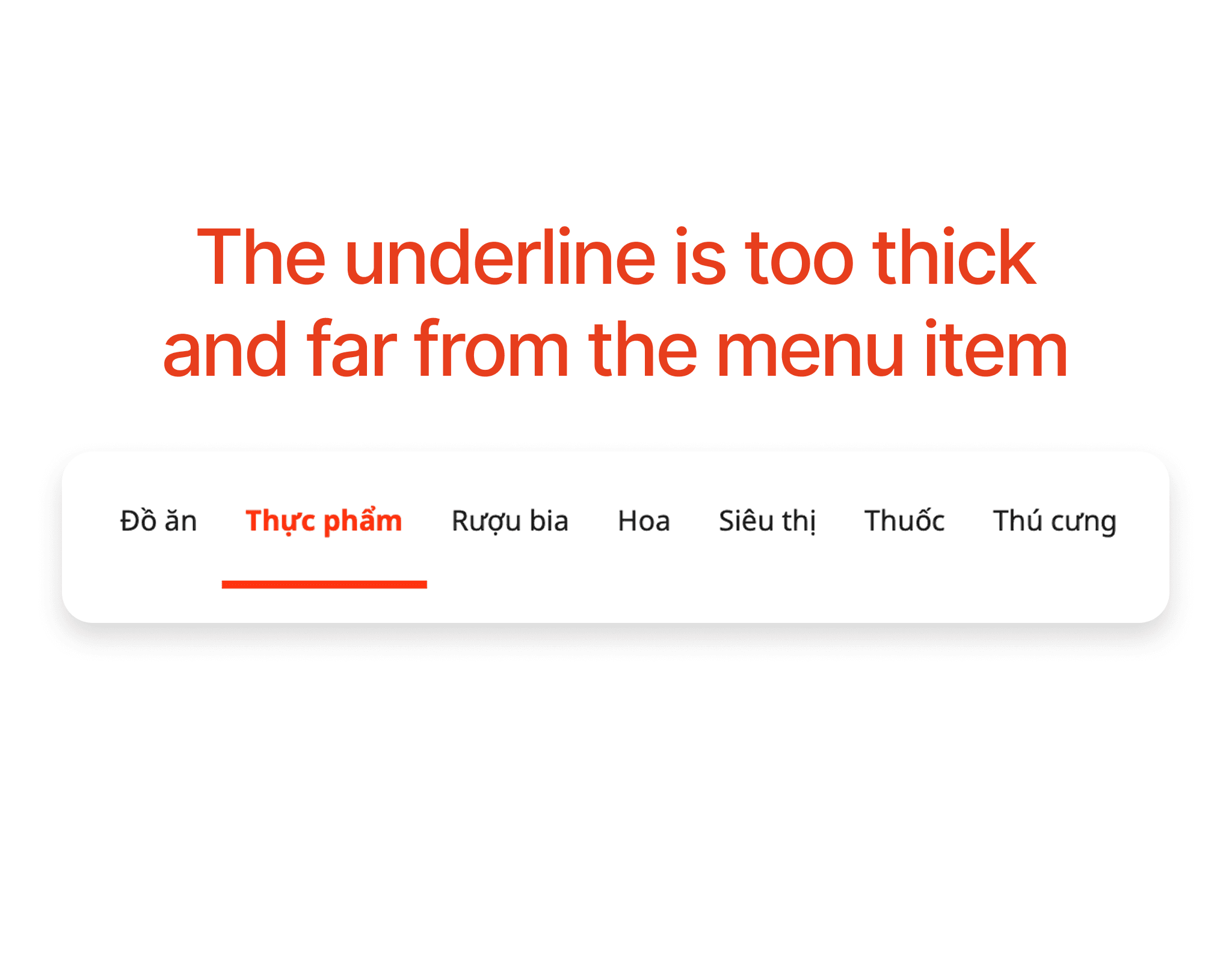
The underline on the menu items is currently too thick and spaced too far from the menu items. This creates a feeling of inconsistent design, making users feel that the underline is unrelated to the menu item, even though it is an important indicator of which item is selected.
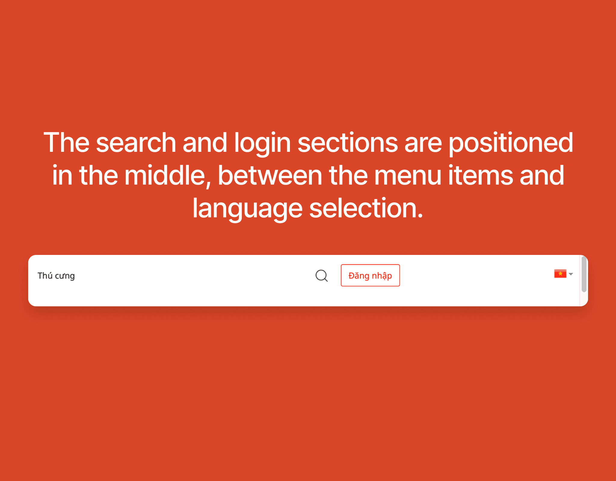
The search button and login button are placed between the menu and the language selection, which makes the overall design inconsistent, lacking aesthetics, and difficult for users to navigate.
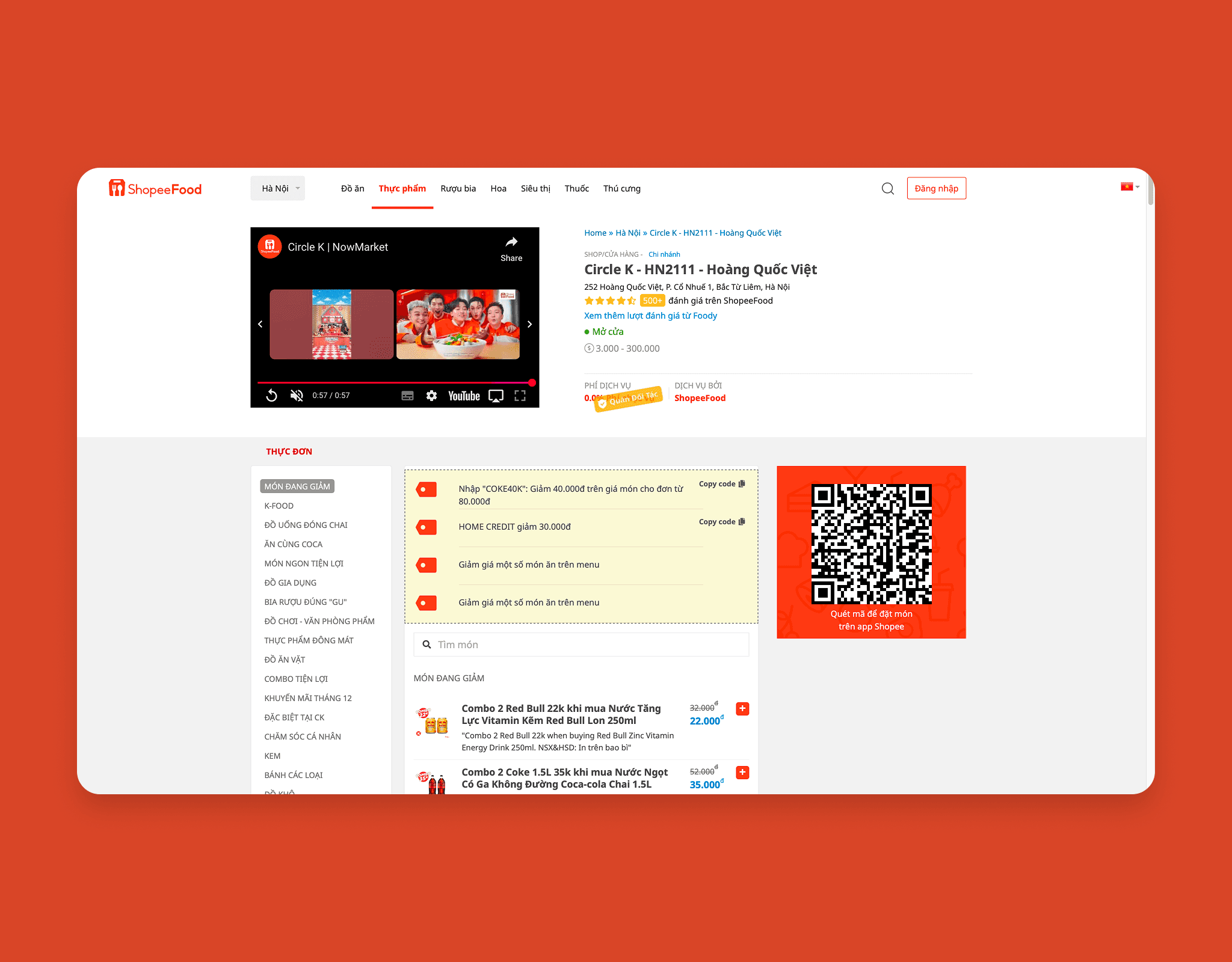
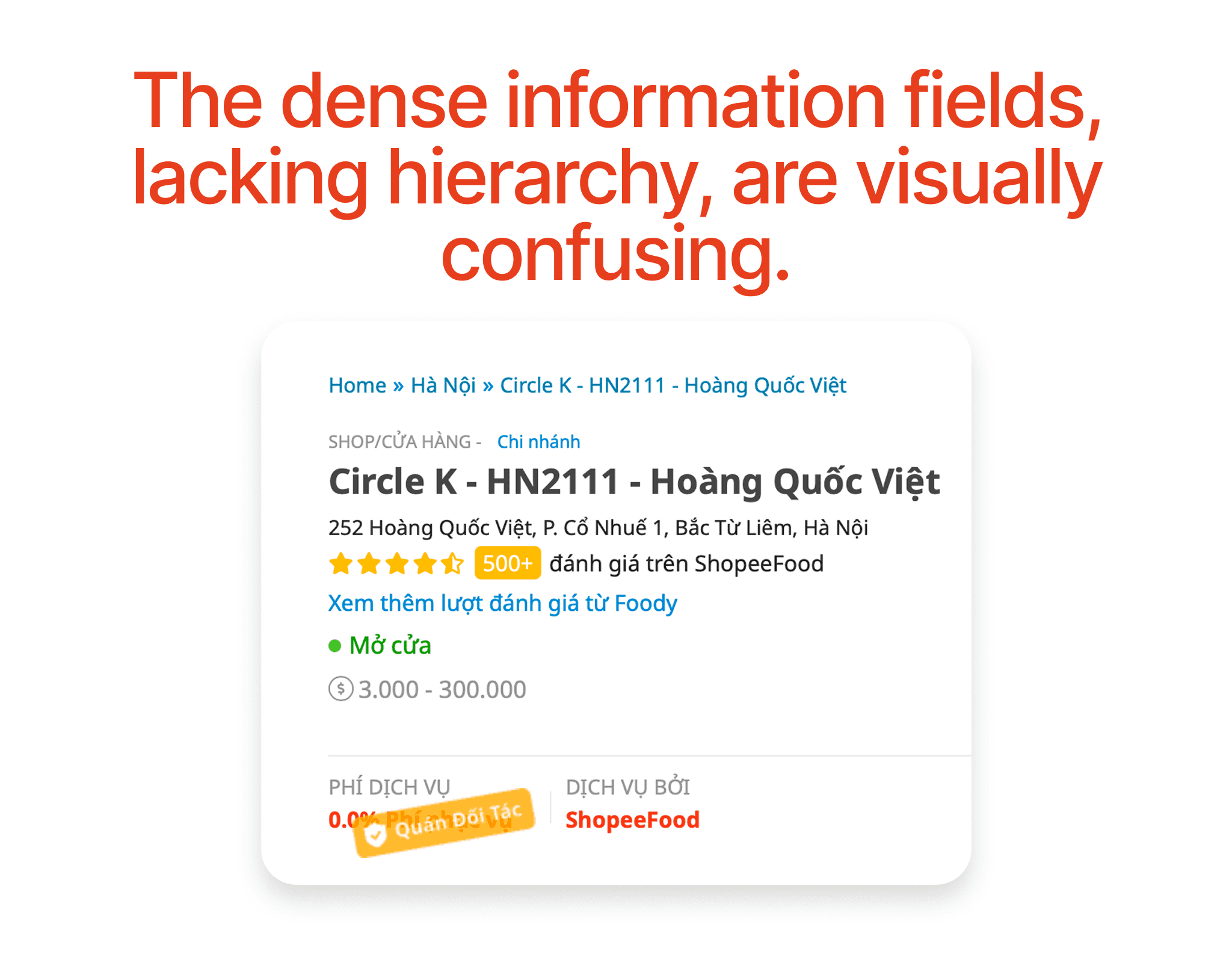
The Shop information is presented in a cluttered manner, with dense information fields that are not clearly hierarchized. This causes users to overlook and not want to read the information.
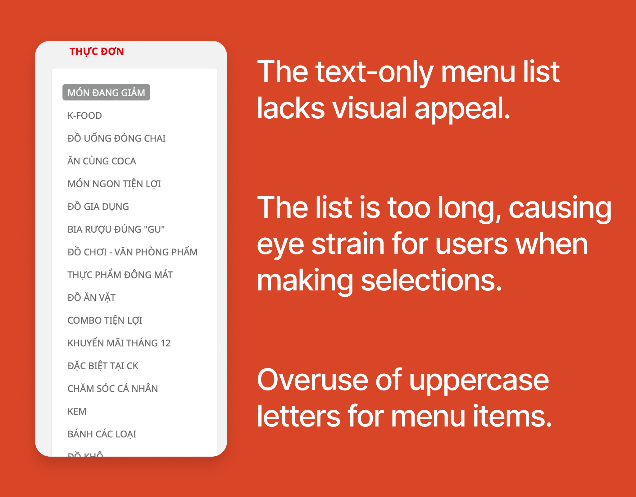
The current menu list is very long and primarily text-based, making it difficult to read. Furthermore, the excessive use of uppercase letters has made the content visually overwhelming and hard to access. This complicates users' ability to search for and choose suitable dishes.
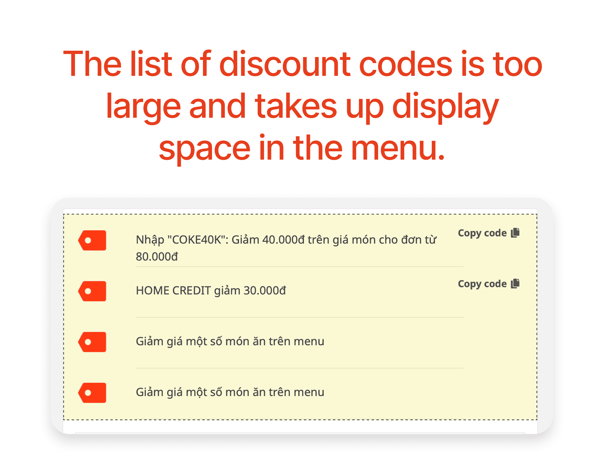
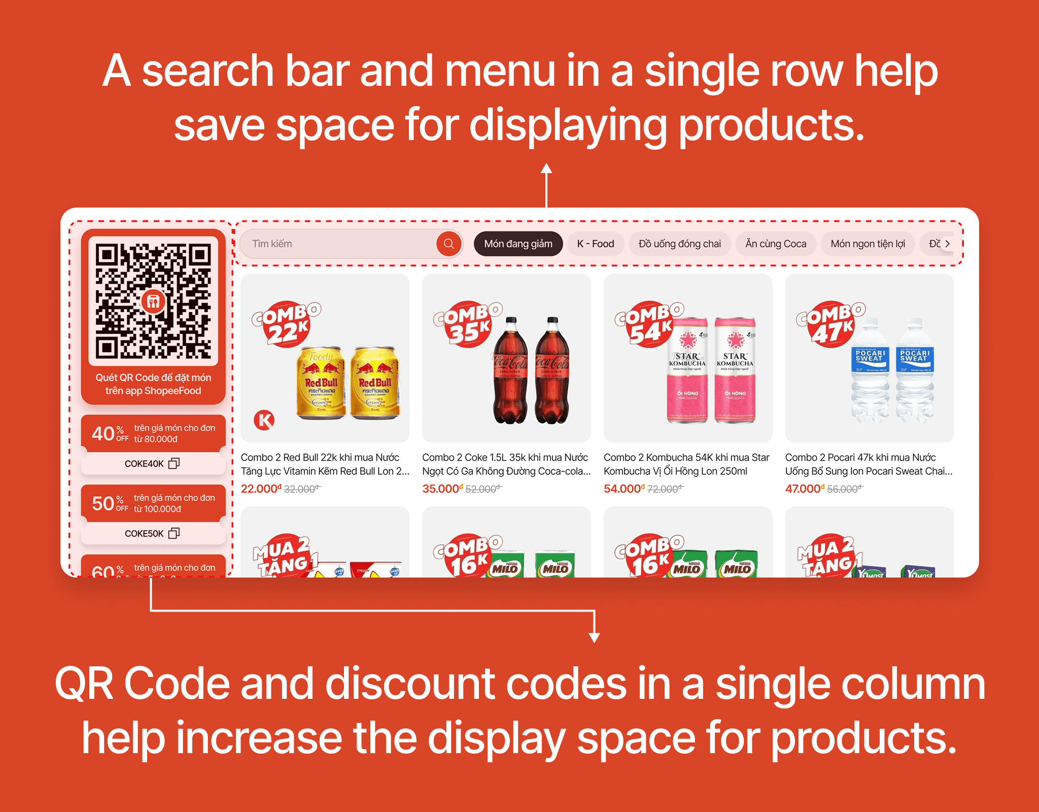
The discount code list is located at the top of the product list and takes up a lot of space. Additionally, the discount codes are not clearly designed, and the promotional information is not highlighted. The last two discount codes are identical.
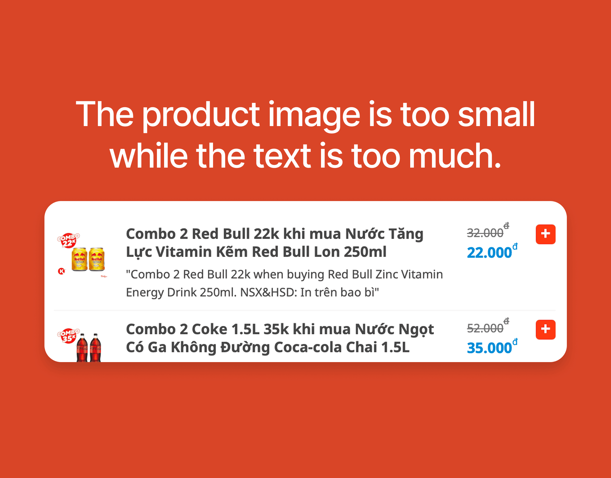
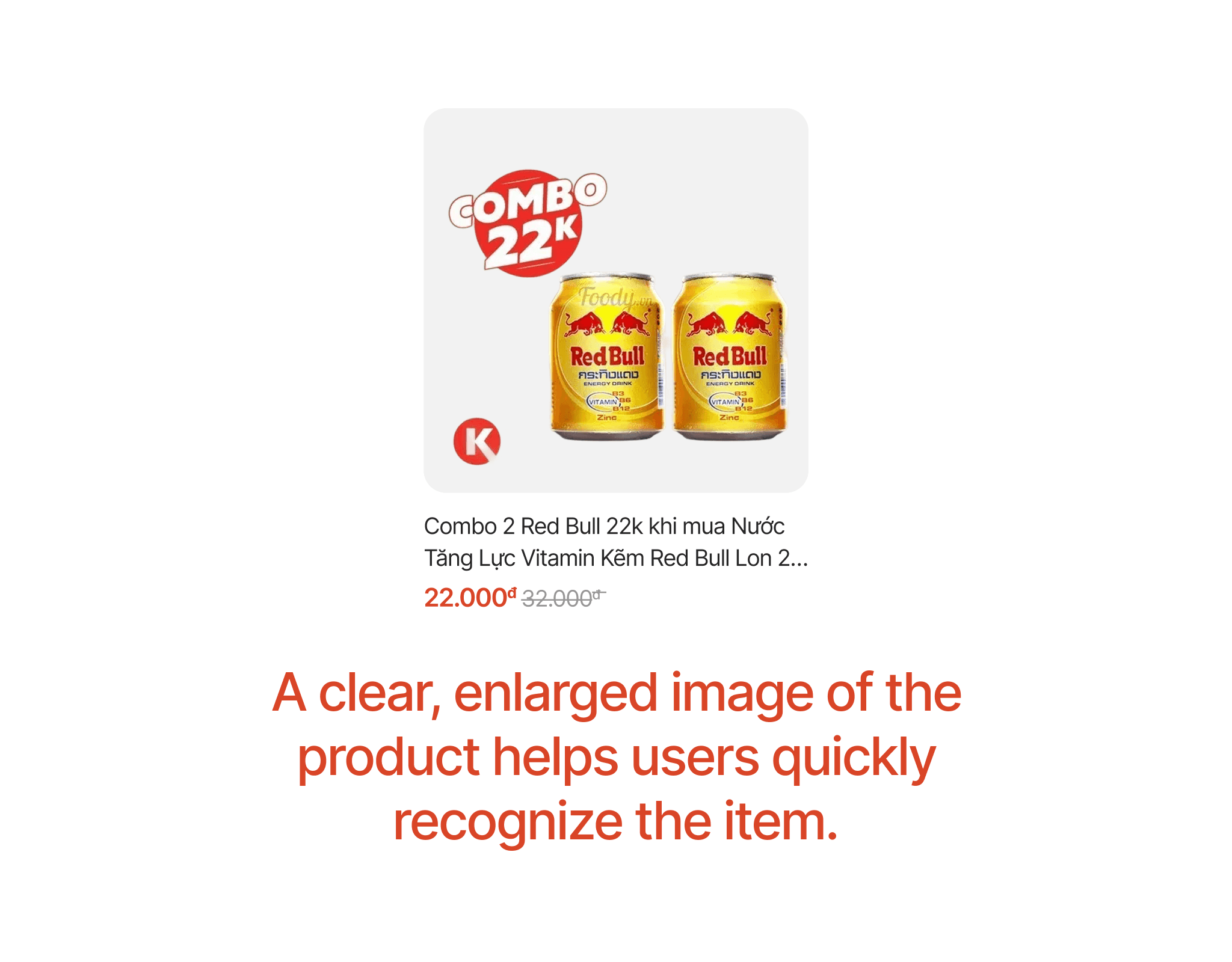
The product images are too small to be recognizable while the text is too lengthy and takes up too much space, making the design lack visual clarity. Users tend to choose products based on specific images.
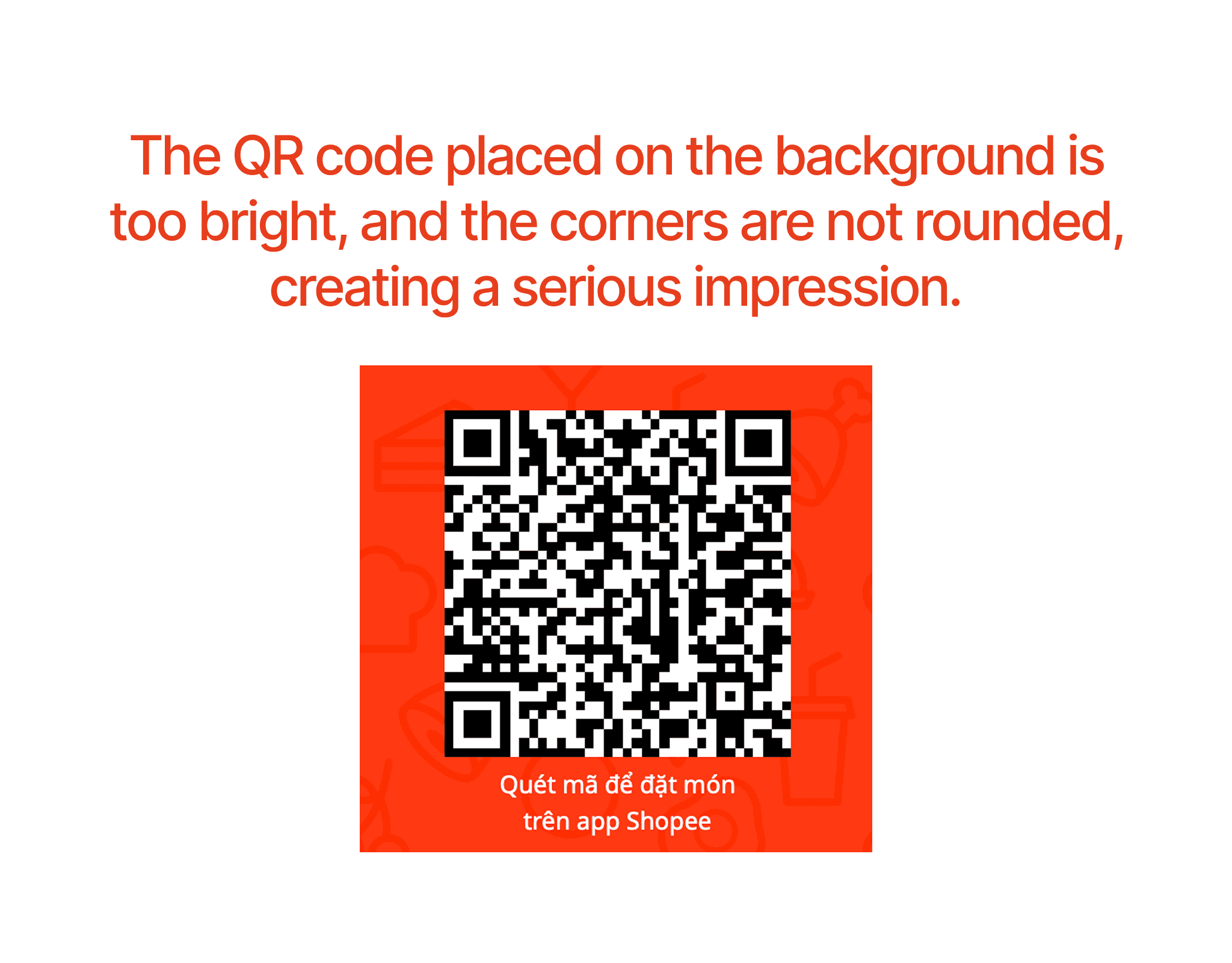
The QR code for downloading the app is placed on a bright orange background, and the corners of the QR code and the orange background are not rounded, making the design severely lacking in user-friendliness.
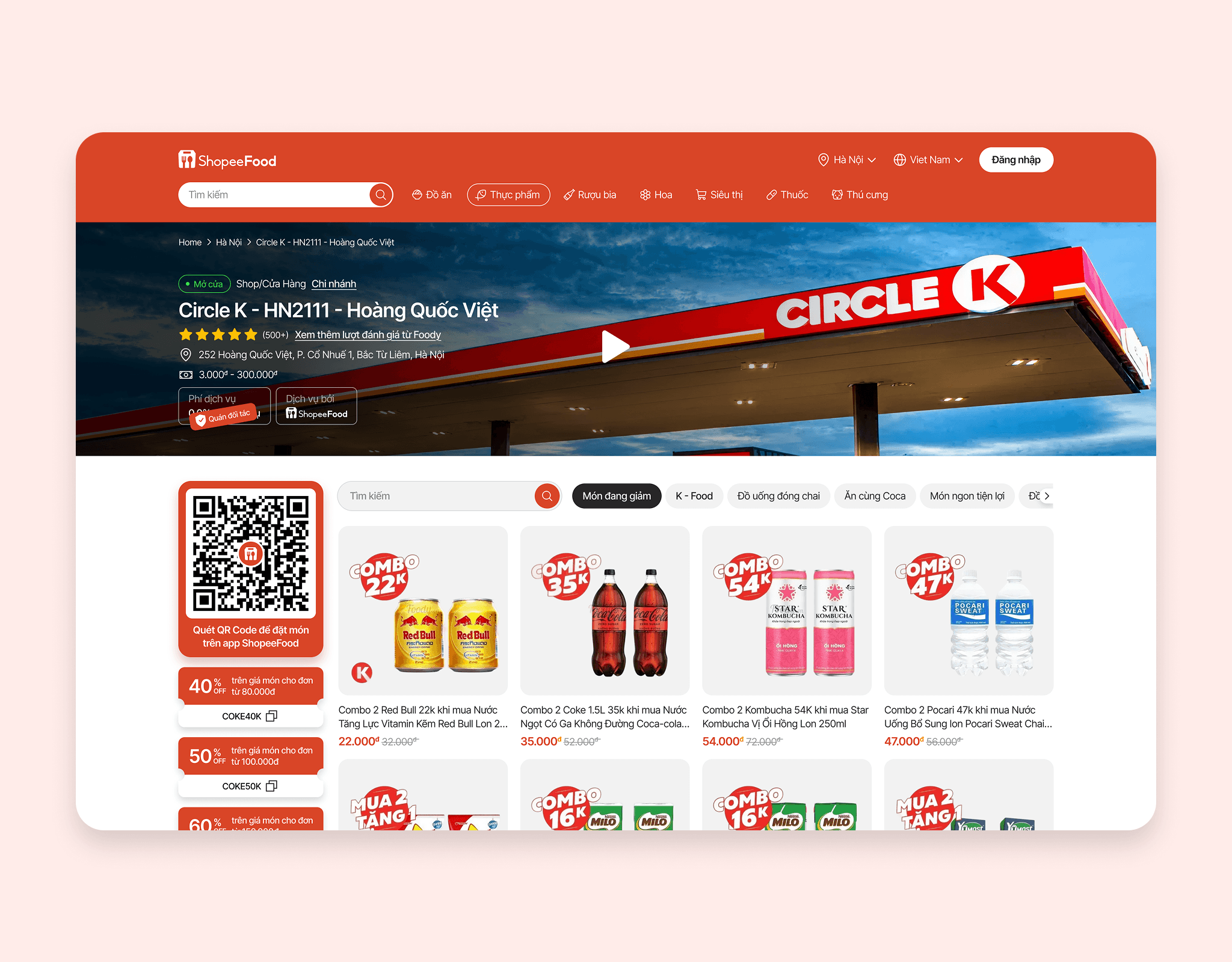
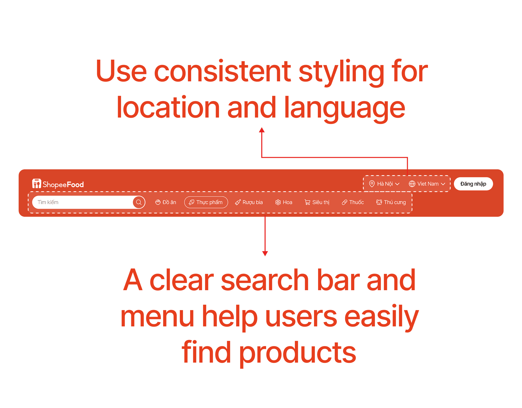
Below is the new Header; in this new design, the location and language selection are designed cohesively, grouping the location, language, and login button into one section. The search bar is enlarged and placed next to the menu, making it easier for users to search for products.
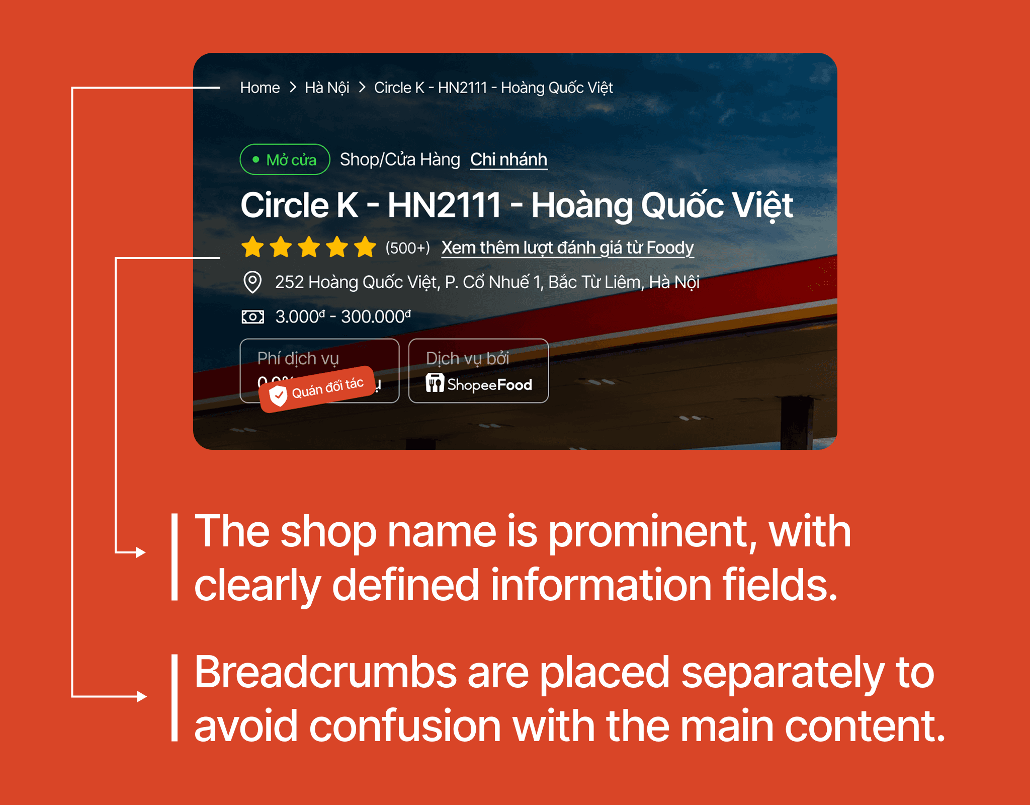
Breadcrumbs are placed at the top, separated from the main content cluster, making it easier to read and not visually overwhelming. The main content cluster is clearly hierarchized with the Shop name displayed prominently, helping users easily read the information.
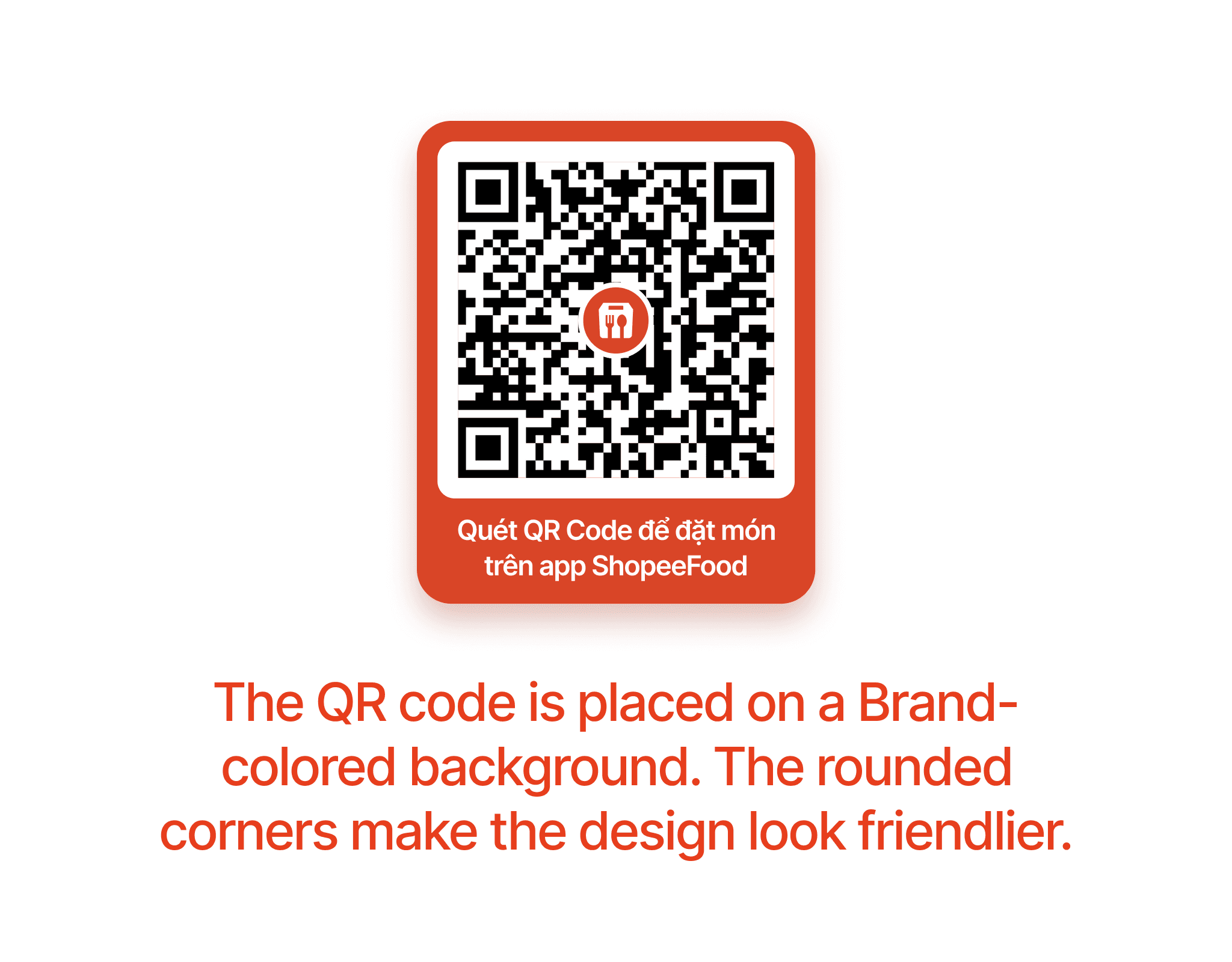
The QR code is placed on a primary color background that is not too bright, and the corners are rounded, making the design appear more user-friendly. Additionally, the QR code includes the ShopeeFood logo, enhancing its visual appeal and recognition.
The product card has been redesigned with a larger image, allowing users to quickly recognize the product and making the design more visual and appealing. The product title is standardized to two lines for all products.
In this new design, the menu and search bar are placed in a single row to save space for displaying products. On the left, I placed the QR Code and discount codes in a column to maximize the display space for the product list.
Below is the Shop screen of the new design.