A Complete Guide to Component Properties in Figma

Components are the core foundation of modern UI design. In Figma, a component is a reusable design element that ensures consistency and saves time when working across multiple screens. Instead of editing each repeated detail, designers only need to update the master component, and all instances will automatically sync.
Using components not only keeps the design system tidy and scalable but also creates a strong link between design and product development, especially effective when working in teams or building a long-term design system.
In this article, I will provide a detailed guide on how to use the properties of Components in Figma with simple examples.
Here are 5 properties of a component:
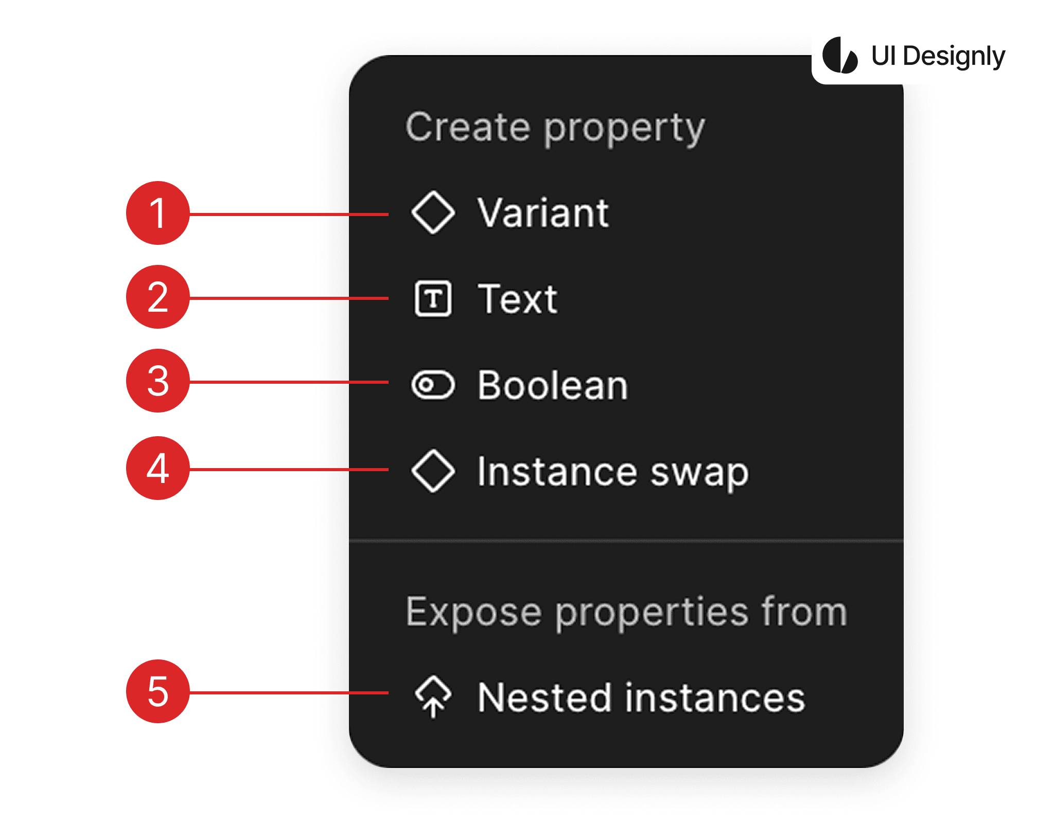
Variant is used to manage multiple states or versions of the same component within a unified system. Instead of creating many discrete components, Variant helps consolidate everything into one component set, making it easier to select, maintain, and closely aligned with the “props” mindset in programming. For example: buttons can have Primary / Secondary, Default / Hover / Disabled, Small / Medium / Large.
The Text property allows you to edit the text content directly from the instance without needing to go into the master component. This is very suitable for elements like button labels, titles, subtitles, prices, etc. This feature allows designers to change content flexibly while maintaining the standard structure and style of the component.
Boolean is a toggle property (true – false) that controls the visibility of an element within the component. Thanks to Boolean, a component can respond to various situations without needing to create redundant variants. For example: toggling an icon, a “New” badge, loading states, outline borders, etc.
Instance Swap allows you to replace a child component with another component of the same type. It is often used to swap icons, avatars, illustrations, or items in a list. This feature is extremely powerful when combined with an icon system, enabling quick content changes while keeping the layout stable.
Nested Instances allow you to expose the properties of nested components. This way, you can control child components directly from the parent component without needing to “dive deep” into each layer. This feature makes complex components easier to use, very suitable for large design systems or team collaboration.
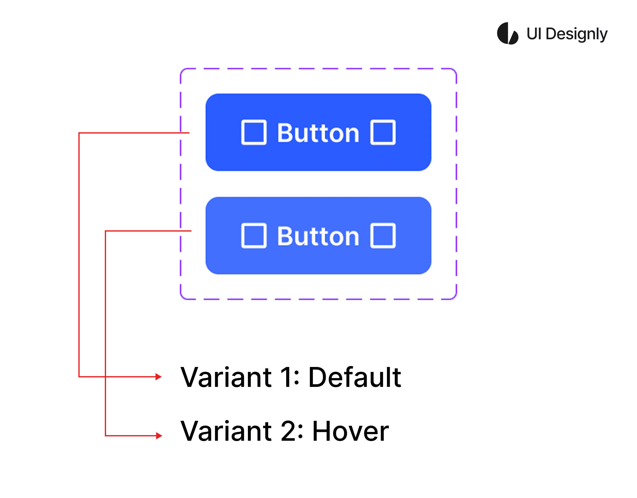
In the example below, I use a "button" with 2 "variants" as an illustration. After creating the 2 variants, Figma will automatically display the "variant property". To edit the "variant property", click on the "Edit" icon as shown, then the "Edit Variant Property" panel will appear. At the top is the name of the property — here I rename it to "State". Below are the values of the property — here I set them to "Default" and "Hover".
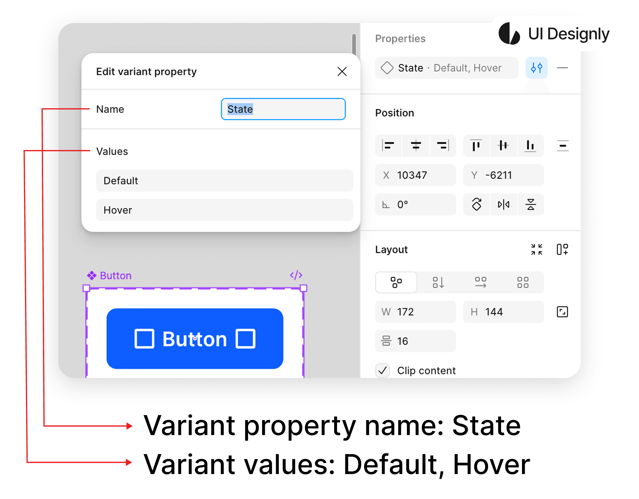
After naming the 2 variants, I have a button component with 2 variants: "Default" and "Hover" as shown. You can create multiple variants for the component to use in your project.
Next, I will guide you on how to create a text property for the button. First, click on the “+” icon as shown, then select “Text”, and the “Text Property” panel will appear as shown. “Name” is the name of the “text property” — here I set it to “Label”; “Value” is the text value — here I set it to “Button”. After naming, click the “Create property” button to finish.
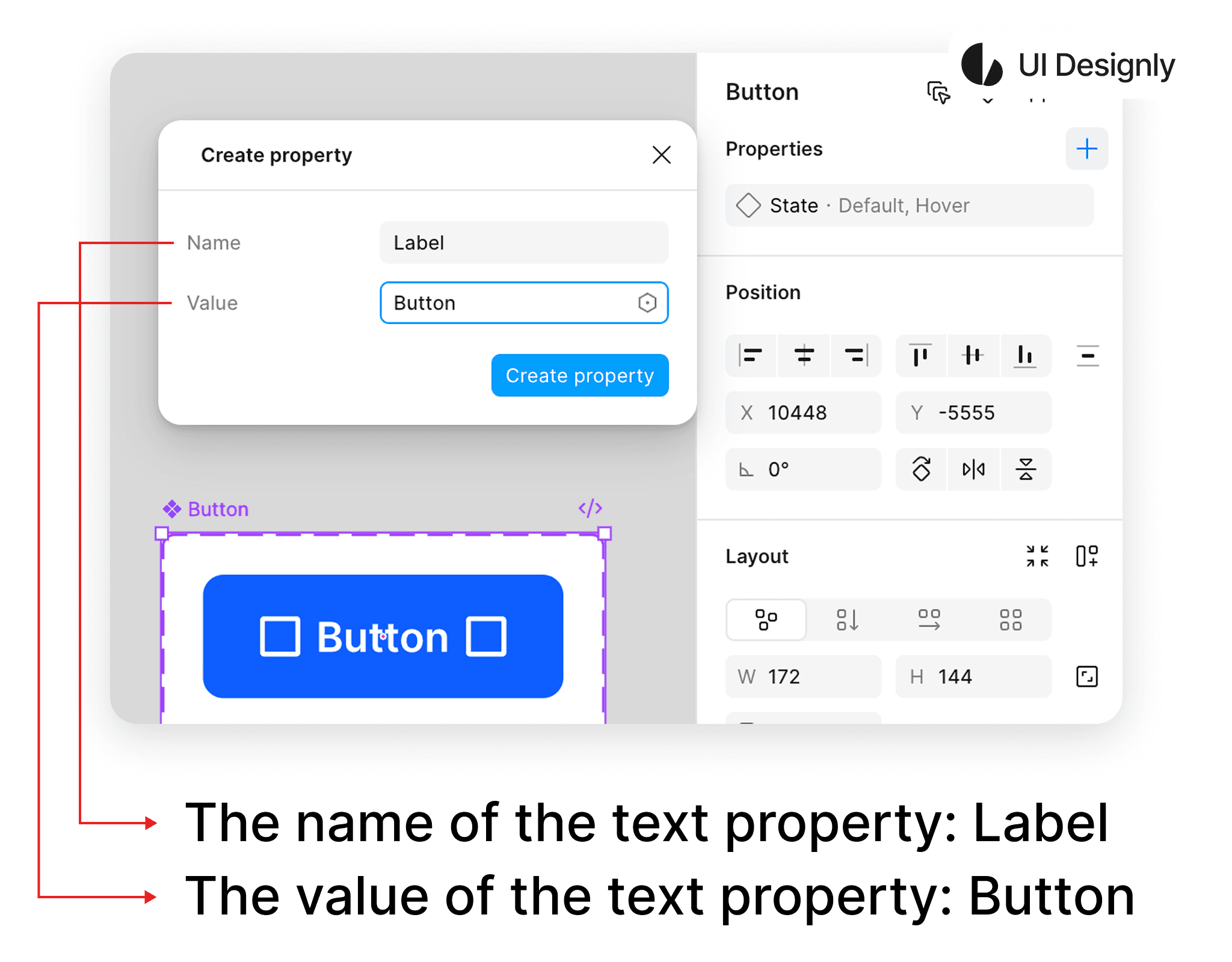
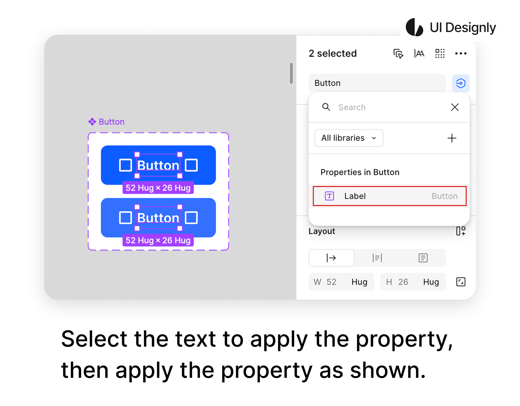
After creating the “text property”, the next step is to apply it to the button. To apply the “text property” to the button, first select the text you want to apply from the button, then click on the “Apply Property” icon as shown. The list of button properties will appear, and finally, select the corresponding text property to complete.
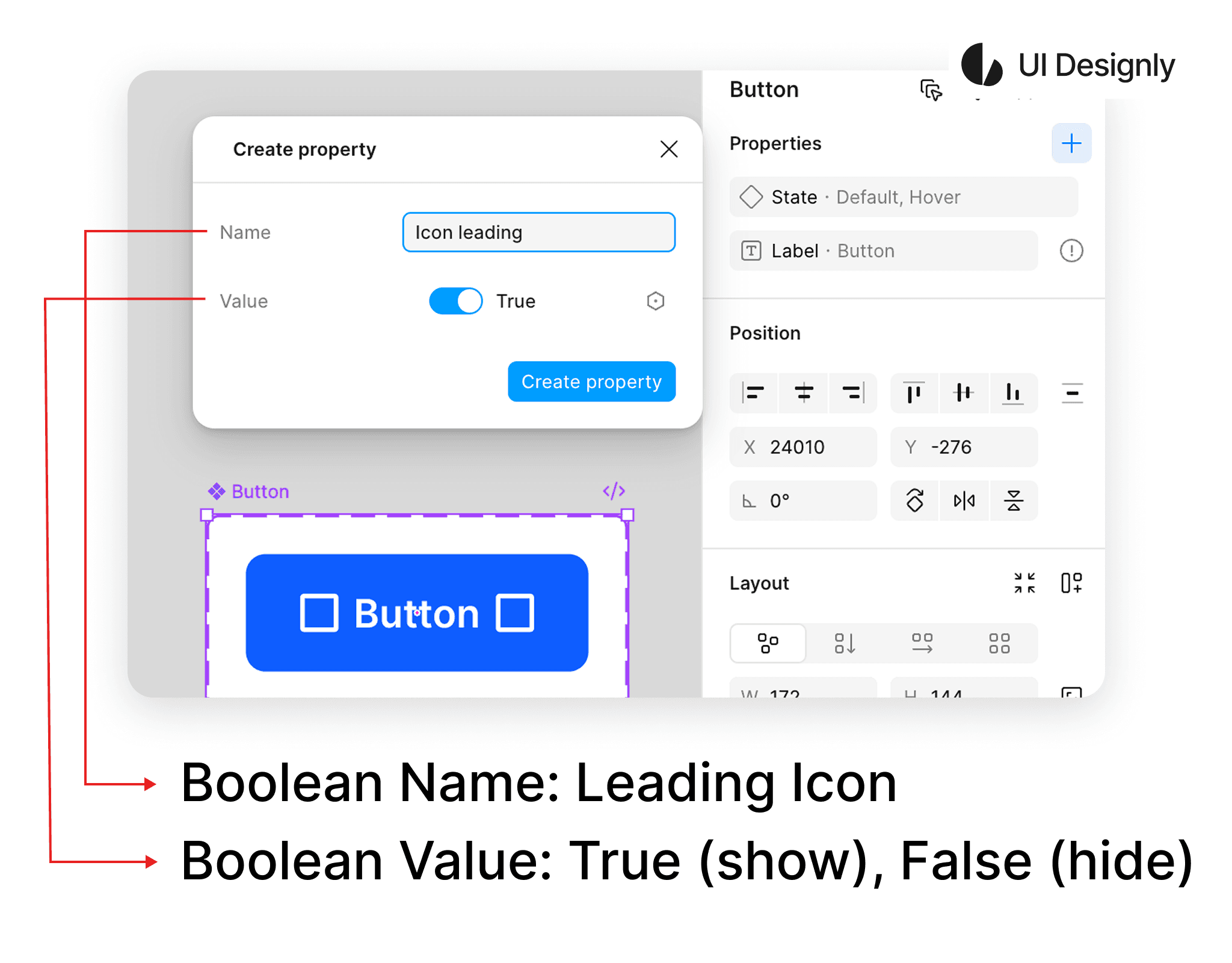
Next is how to create a Boolean for the component. First, click on the “+” icon as shown, then select “Boolean”. The “Create Property” panel for Boolean will appear as shown. I name the Boolean “Icon leading”, and below are the “Value” options: “True – On” to display the element or “False – Off” to hide the element. You can toggle this based on your needs.
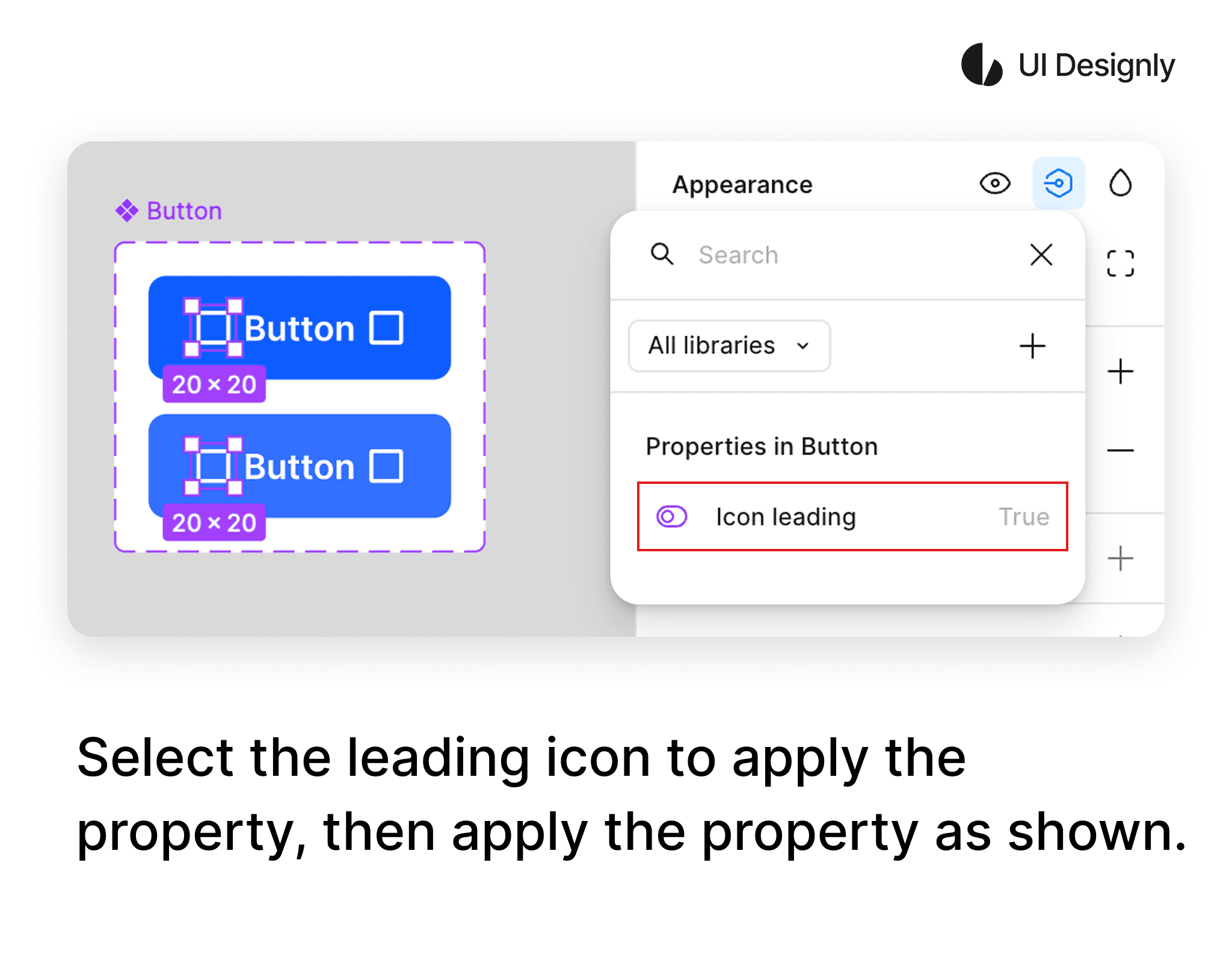
To apply the Boolean to the Icon leading, first select the icons you want to apply as shown. Then, in the Appearance panel, click on the “Apply Property” icon, and the list of button properties will appear as shown. Finally, select the corresponding property to finish.
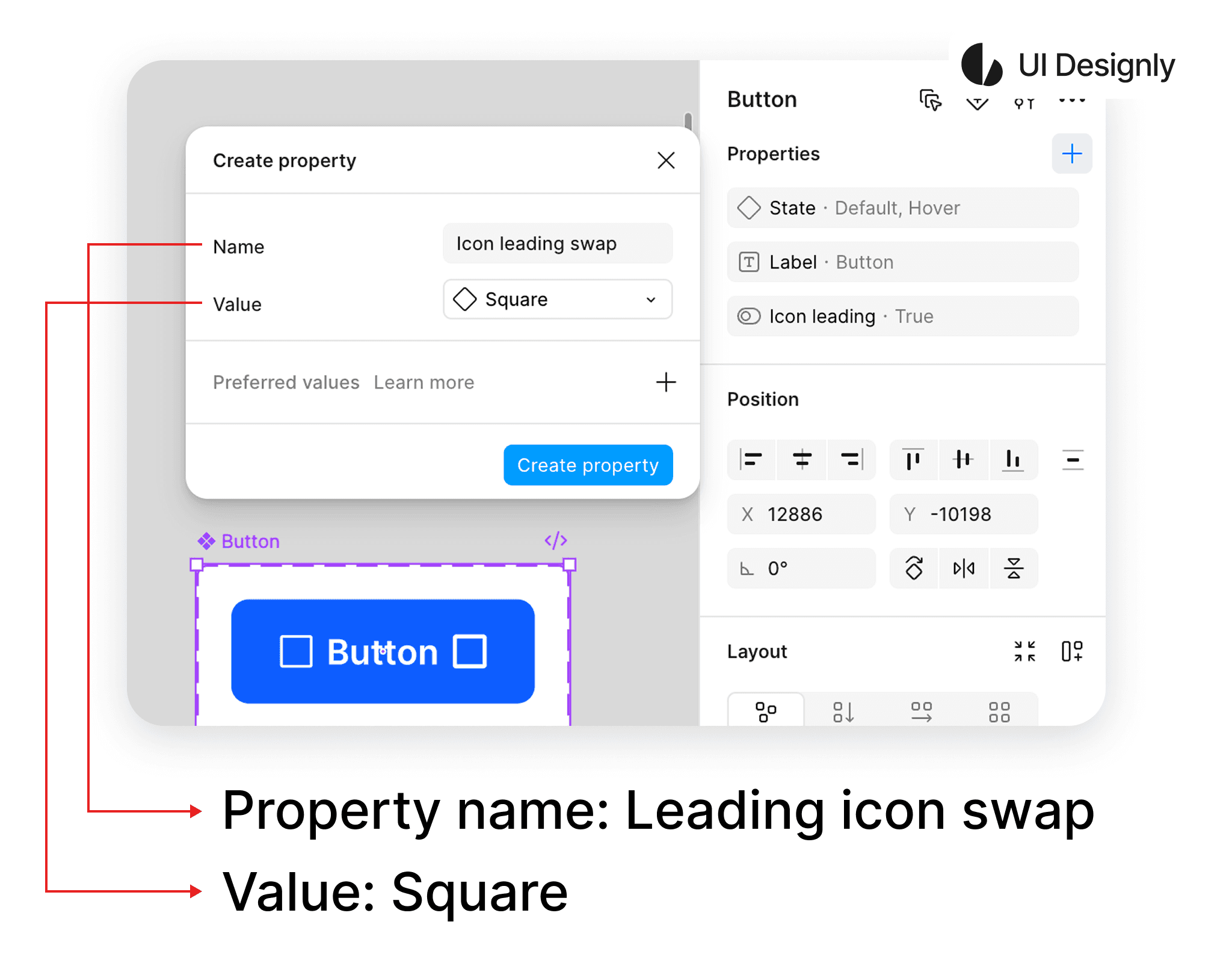
Next is the “Swap Instance” feature. To create it, click on the “+” icon as shown, then select “Swap Instance” and the “Create Property” panel will appear. I name it “Icon leading swap”, and the “Value” is the component value — since I set a placeholder for the icon, I choose “Square”. Finally, click the “Create Property” button to finish.
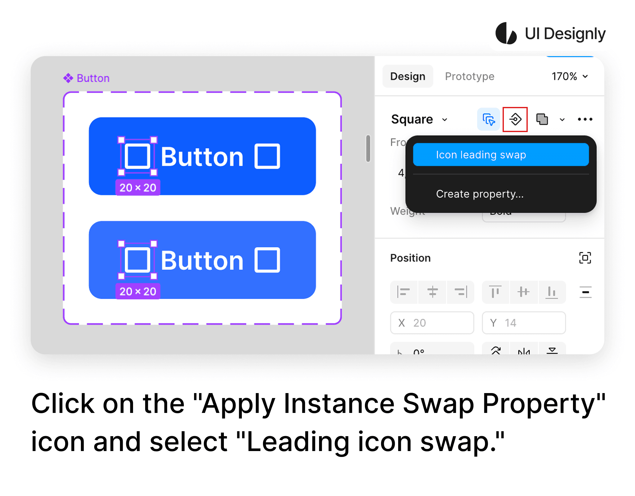
To apply this “Swap Instance” to the button's icon, first select the icon you want to apply as shown, then click on the “Apply Instance Swap Property” icon and select “Icon leading swap” to finish.
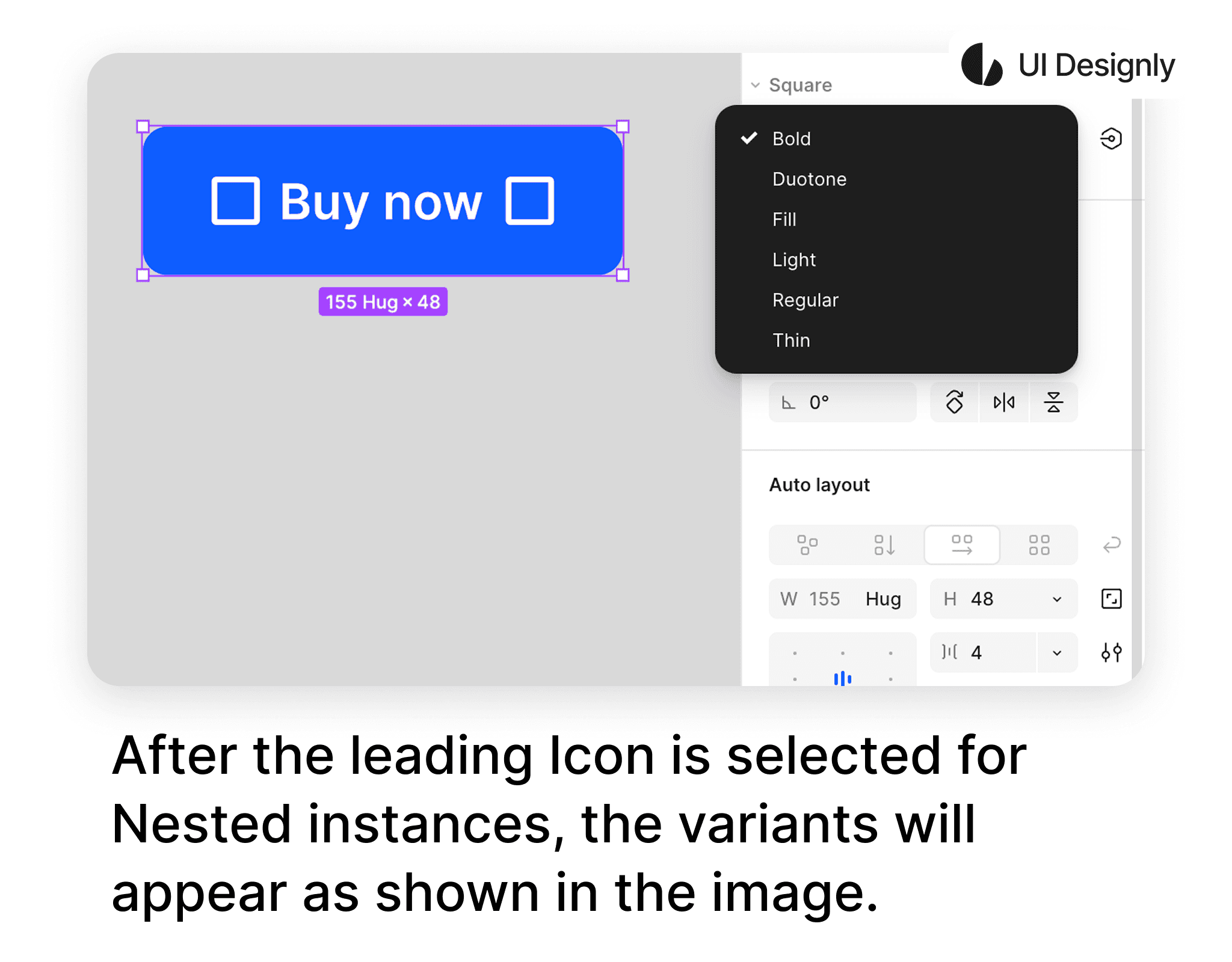
To use the “Nested Instances” feature, first click on the “+” icon as shown, then select “Nested Instances”. The “Expose Properties From” panel will appear with a list of components to expose — here I select the first “Square”, corresponding to the leading icon.
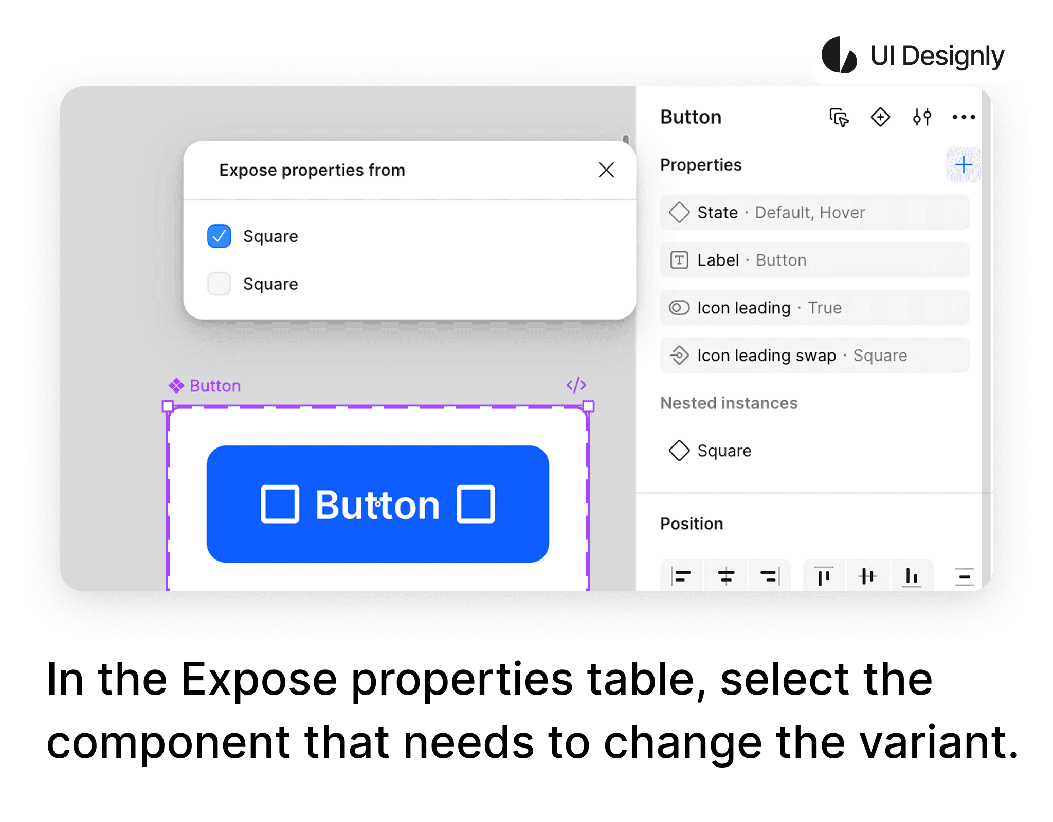
After selecting the leading icon to expose, when selecting the button, options will appear allowing you to change the variants of the icon as shown, without needing to click directly on the icon inside the button to change the variant.