Redesigning the Room Search Experience on Booking: A UX Case Study

Booking is the world's leading travel platform, but their website is really poor in terms of design. In this article, I will analyze the flaws of the room search screen of this platform and how I would fix it. As you can see on the large screen, they set the content width to only 1100px, which makes the content narrow while there is too much whitespace around that is not utilized to display content.
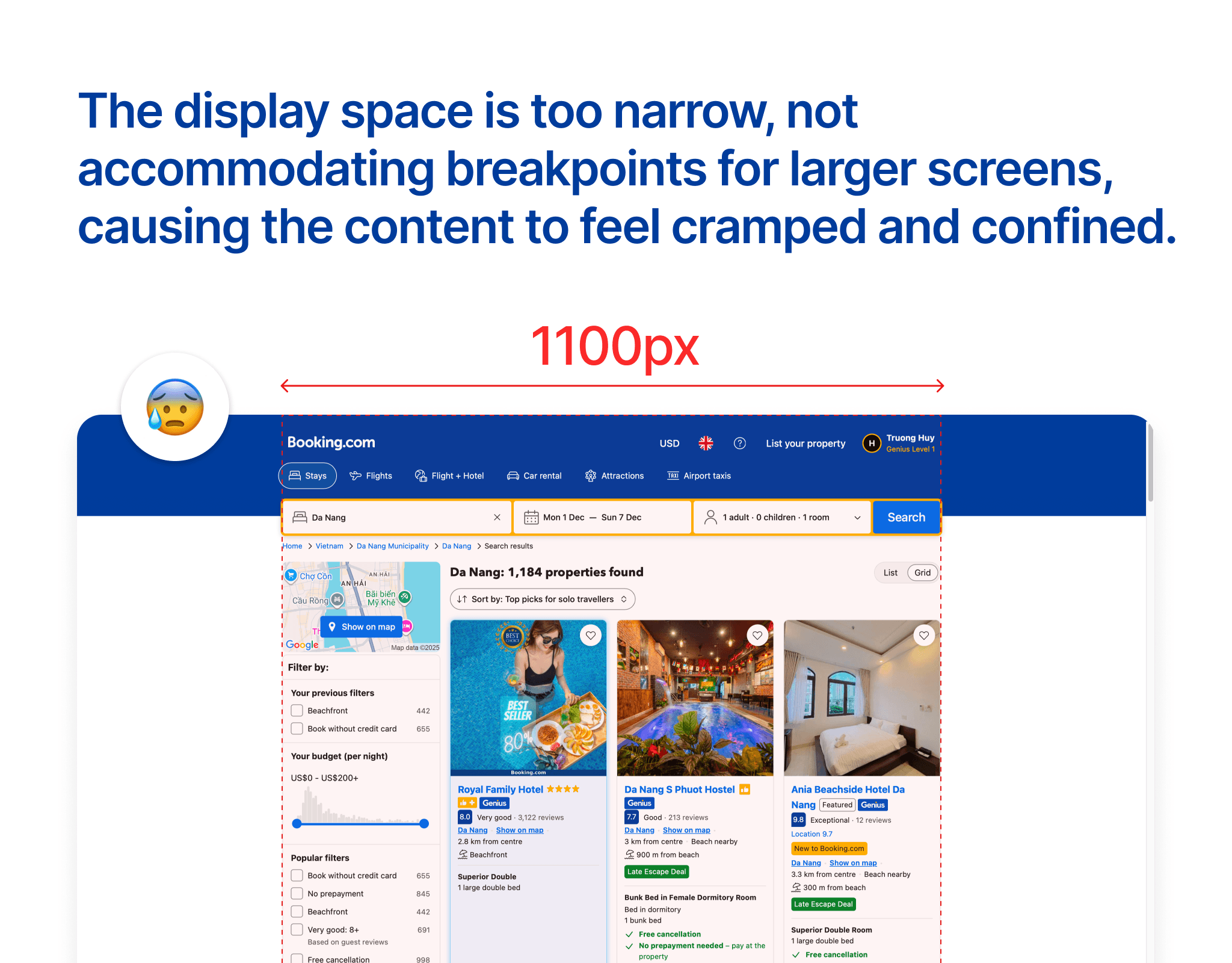
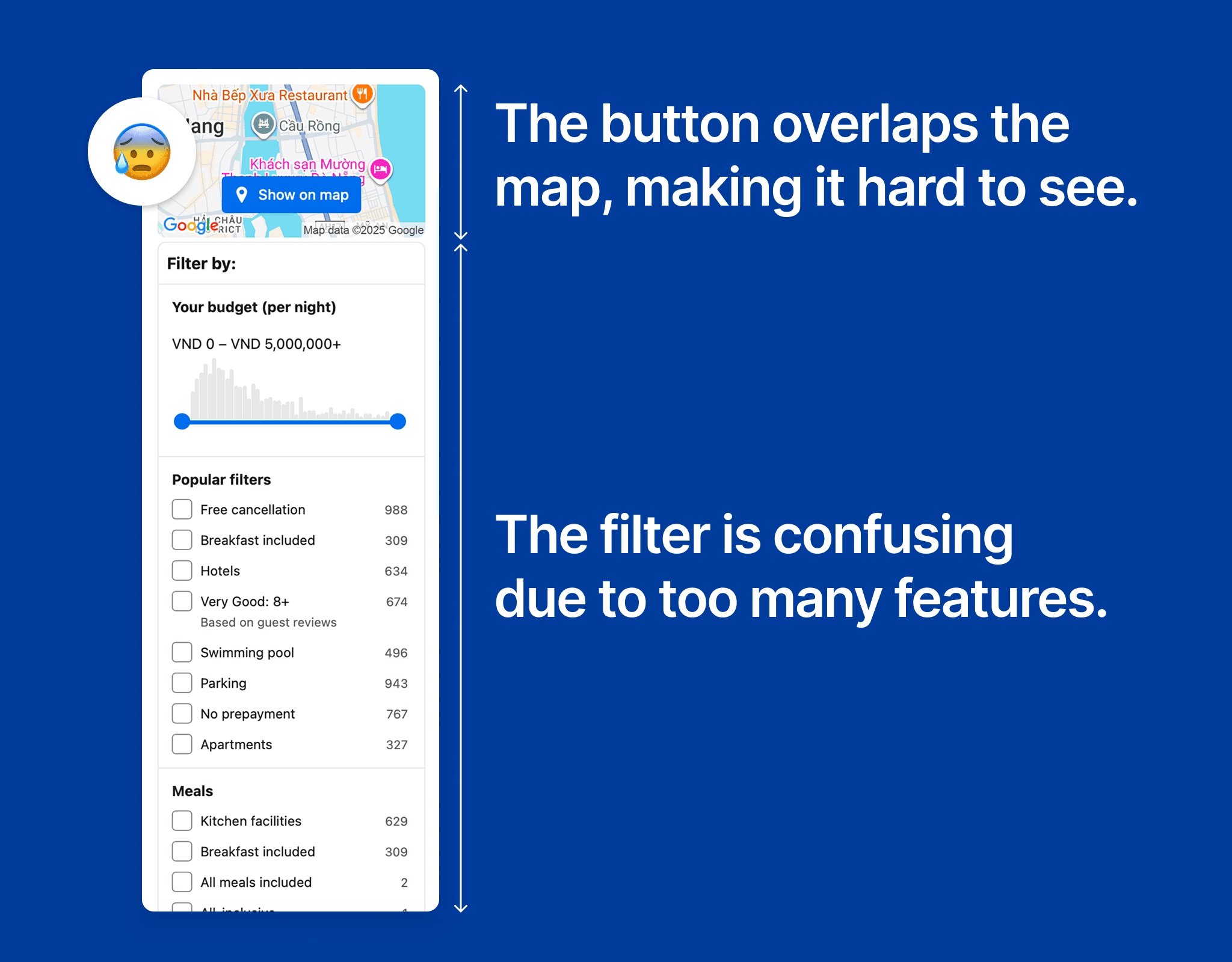
In the filter section, the biggest issue lies in the layout and complexity. Right from the start, the "Show on map" button is overlaid on the map, making it difficult for users to observe the hotel locations. This diminishes the value of the map – which is a key element that helps users make quick decisions. Just below, the filter table stretches with countless options, making the interface feel heavy. Each group of criteria appears continuously without clear prioritization, overwhelming new users. Instead of aiding in narrowing down results, the current design makes the filtering process slow and exhausting. This is a classic example of how too many features do not equate to a good experience. What users need is a streamlined, clear filter that focuses on the most important choices.
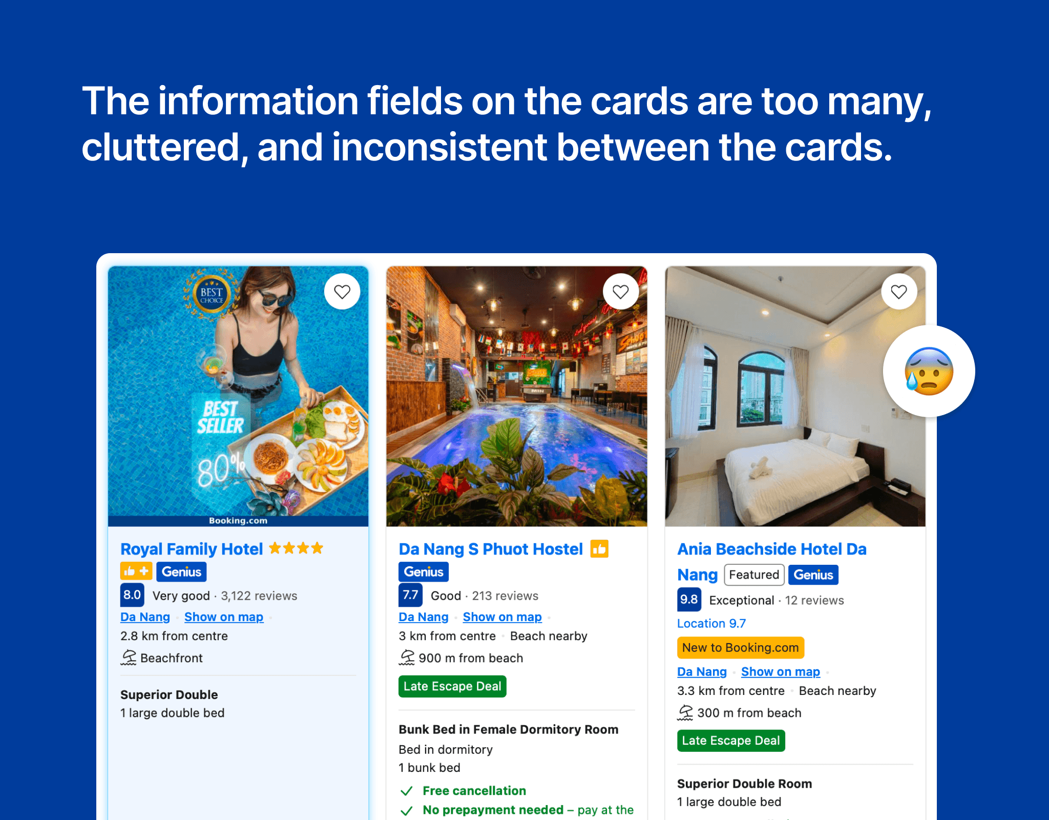
Looking at the three hotel cards in the image, one major issue is immediately apparent: too much information is crammed into a small space, making it easy for viewers to get confused and hard to make decisions. The cards are inconsistent in presentation: each one displays information in a different order, and the icons and colors are not synchronized. Some cards emphasize ratings, others highlight deals, while others add a slew of labels like Genius, Featured, New to Booking.com... This inconsistency makes the experience of browsing the list exhausting. Instead of helping users choose quickly, the redesign forces them to decode each card. This is a prime example of how "more" is not always "better" – especially in interface design, where neatness and prioritization of important information are key.
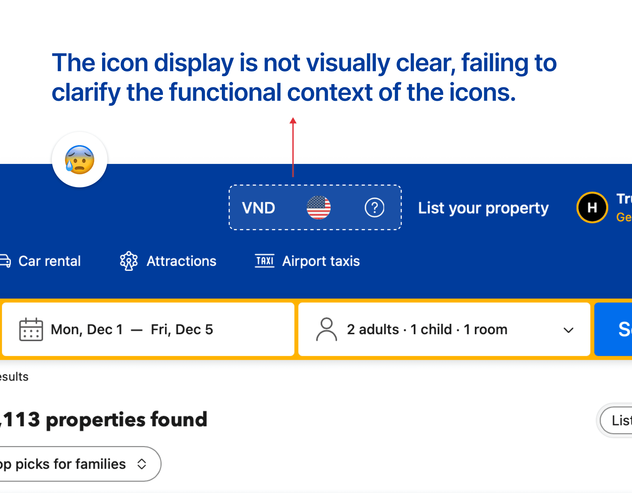
In the header section of the website, three icons are placed that confuse users. First, the currency is displayed as VND, but the language is represented by a flag image, creating inconsistency. Additionally, the help icon is represented by a question mark "?", making the design feel cluttered and lacking coherence. This inconsistency can make it difficult for users to understand the information the website wants to convey.
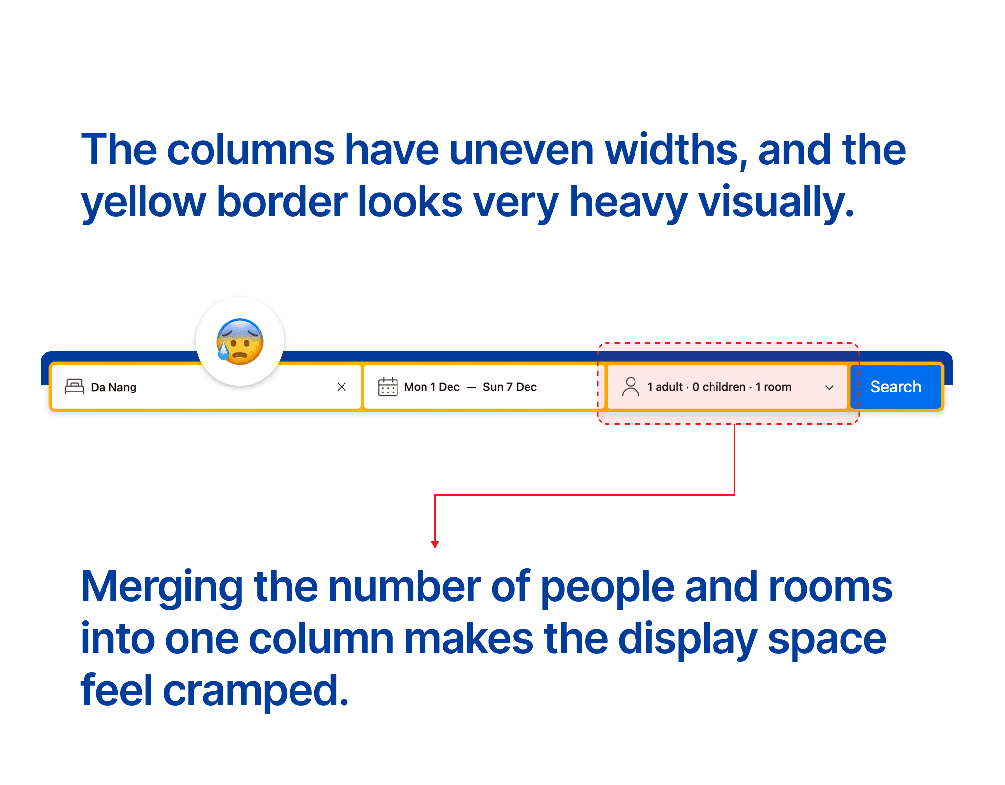
Using yellow borders for the information columns creates a heavy visual feel. There are three information columns: Location, Time, and Number of People + Number of Rooms. However, the widths of the columns are uneven; the Location column is significantly larger than the other two, leading to a lack of consistency in design. Furthermore, combining Number of People and Number of Rooms into one column makes it difficult for users to track the information.
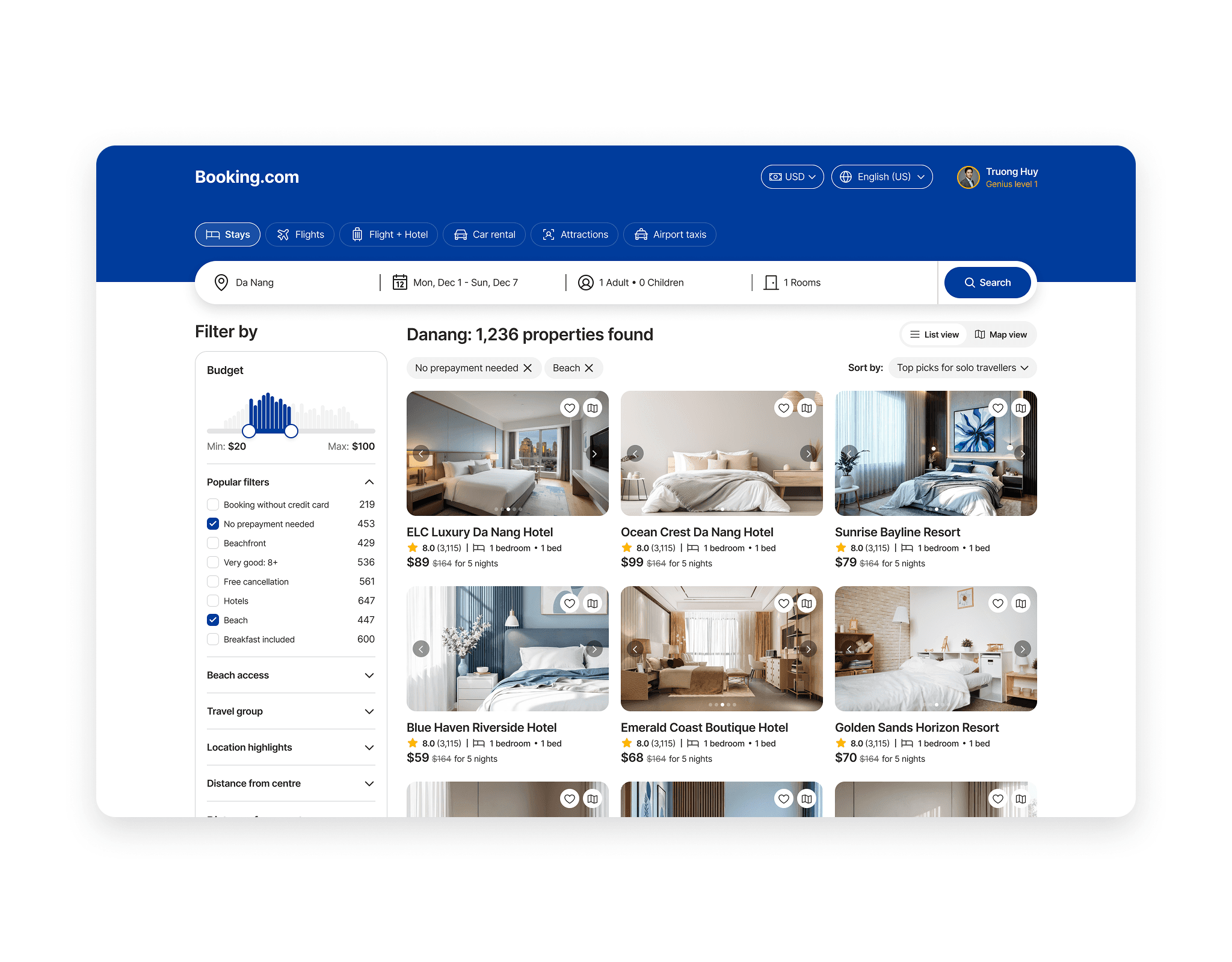
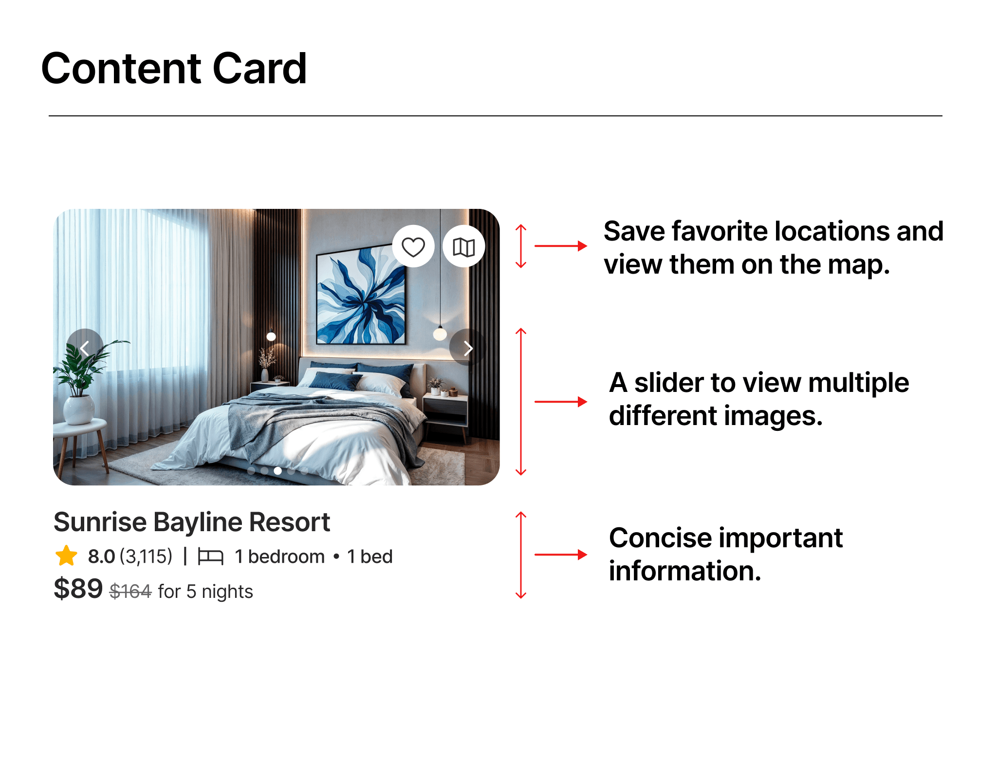
In this new design, I have removed many unnecessary information fields, keeping only the important ones such as: location name, user ratings, number of rooms + beds, and price. In the image section of the location, I added a slider so users can view more images of the location. In the top right corner of the image, I placed two button icons for favorites and view on map, allowing users to quickly save their favorite locations and see those locations in detail on the map.
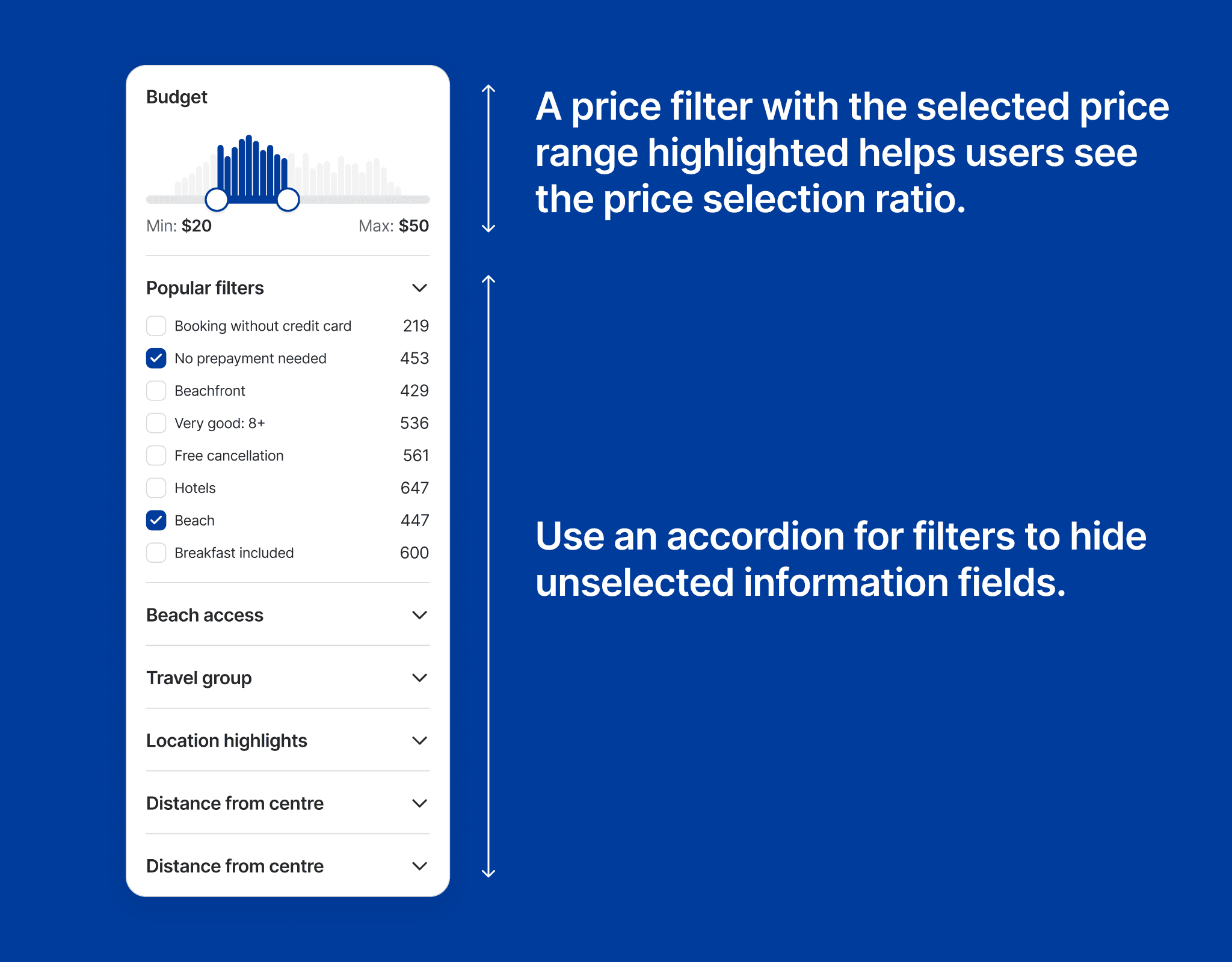
In this filter column, I have adjusted it to optimize the design. In the Budget section, when users select a price range, the selected part lights up in green, helping users grasp the volume of users choosing this price range. Next, in the filter section below, I used an accordion to hide subcategories and only display the selected item, making the filter look clearer and reducing reading pressure on users' eyes.
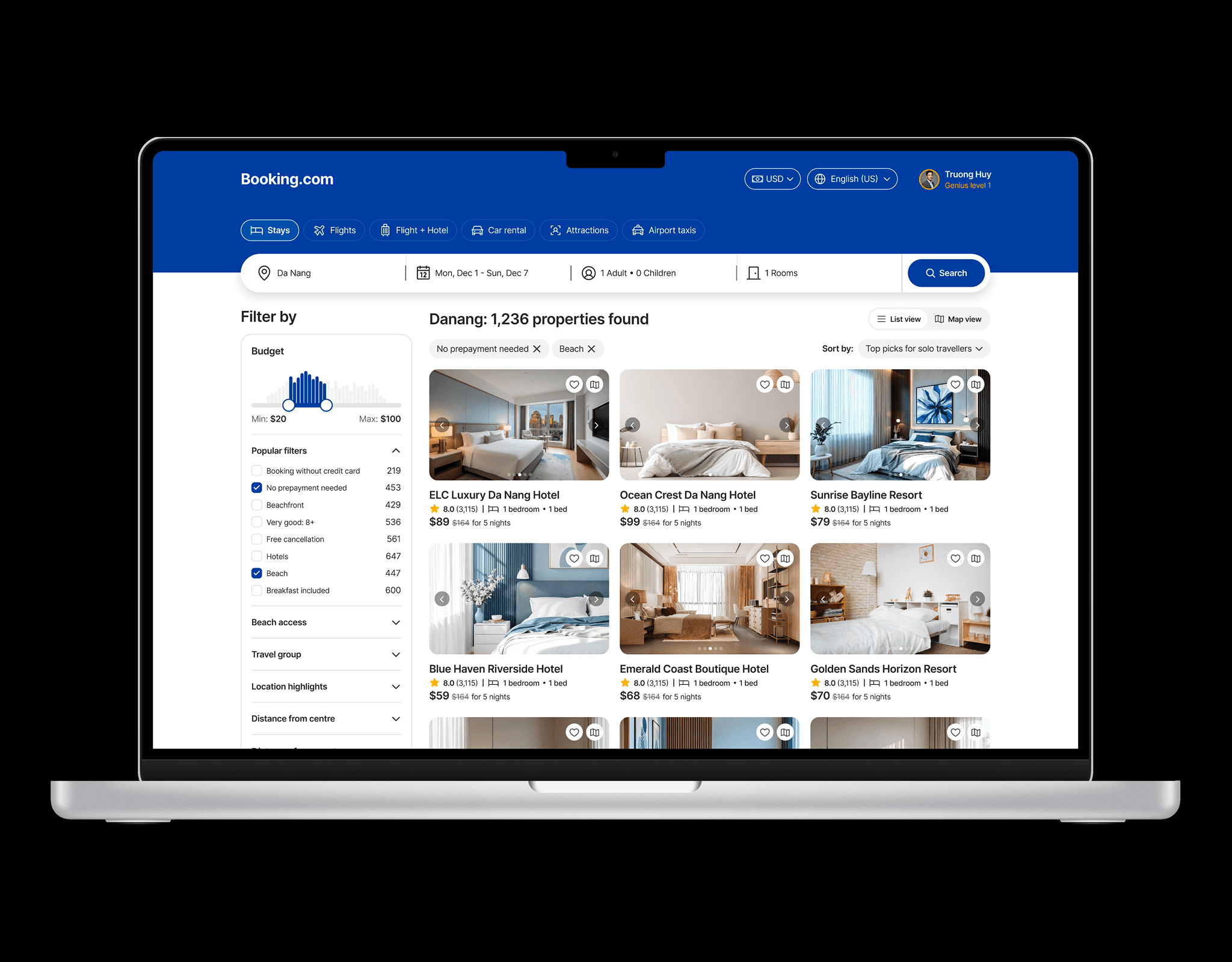
On the large screen, I used a breakpoint of 1400px to allow the design to expand on both sides, making the most of the excessive whitespace on either side of the screen. This helps the content to be displayed more broadly, reducing the need for users to scroll.
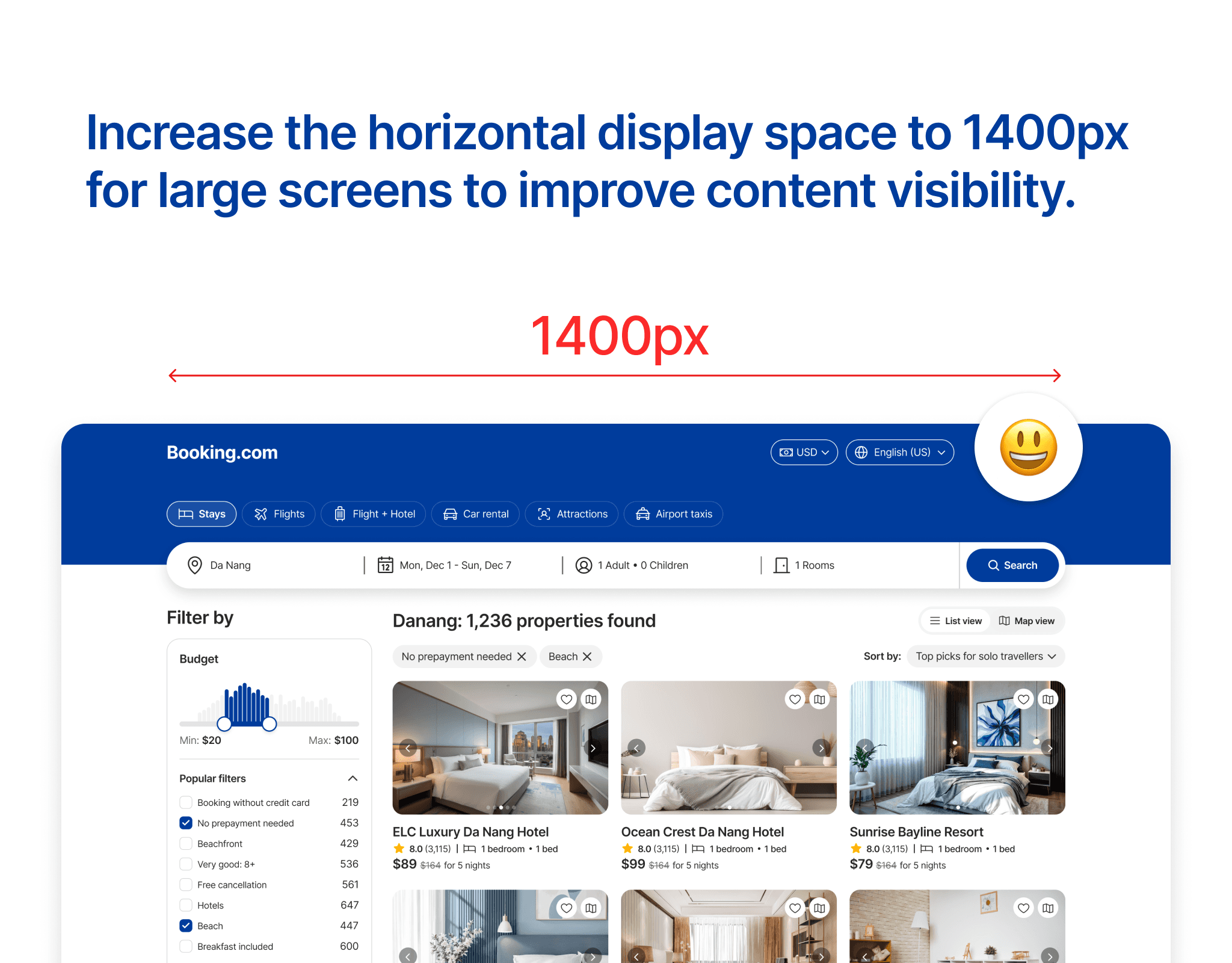
Below is the new design of the room search screen for large screens. In this new design, overall consistency has been achieved from icons to content cards, and the search bar has been redesigned with a modern minimalist style. The filter uses an accordion to hide unimportant information fields and display important fields when users select.