How I Redesigned the Movie Detail Screen of the CGV App

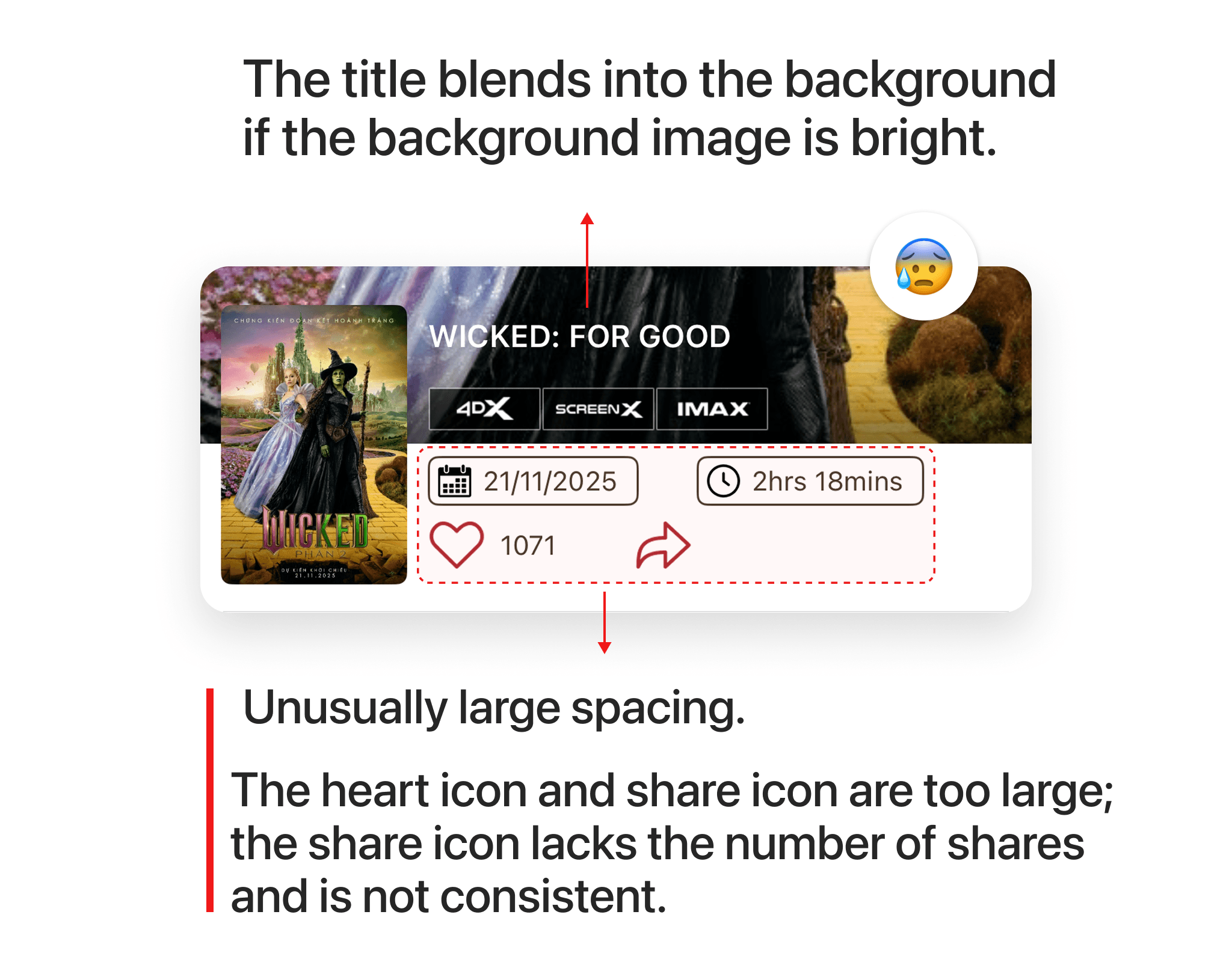
CGV is the leading movie ticket booking app in Vietnam, but their app interface has many issues that need to be addressed. In this article, I will analyze the design of the movie detail screen, the poor interface aspects, and how I redesigned it. As you can see, the movie title is blending into the background due to the lack of a dark overlay over the image. The spacing between information fields such as release date, movie duration, number of likes, and shares is unusual. The like and share icons are abnormally large, and the share icon lacks the share count.
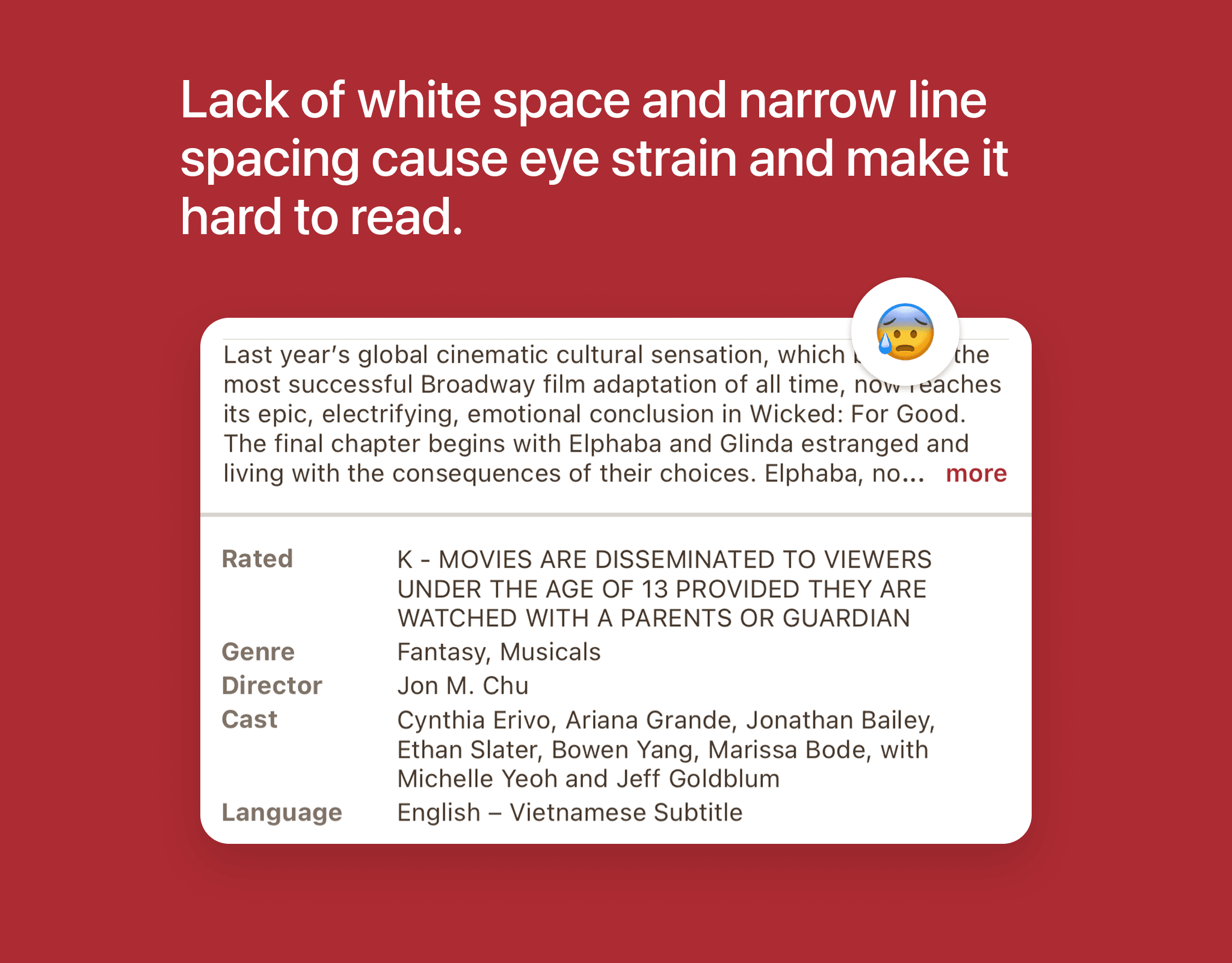
The movie information section overwhelms users due to a lack of white space, overly tight line spacing, and information being placed too close together. This makes it easy for users to overlook and disinclined to read the information, while the movie details are presented entirely as text, lacking other visual elements such as images and icons, making the design feel dry and boring.
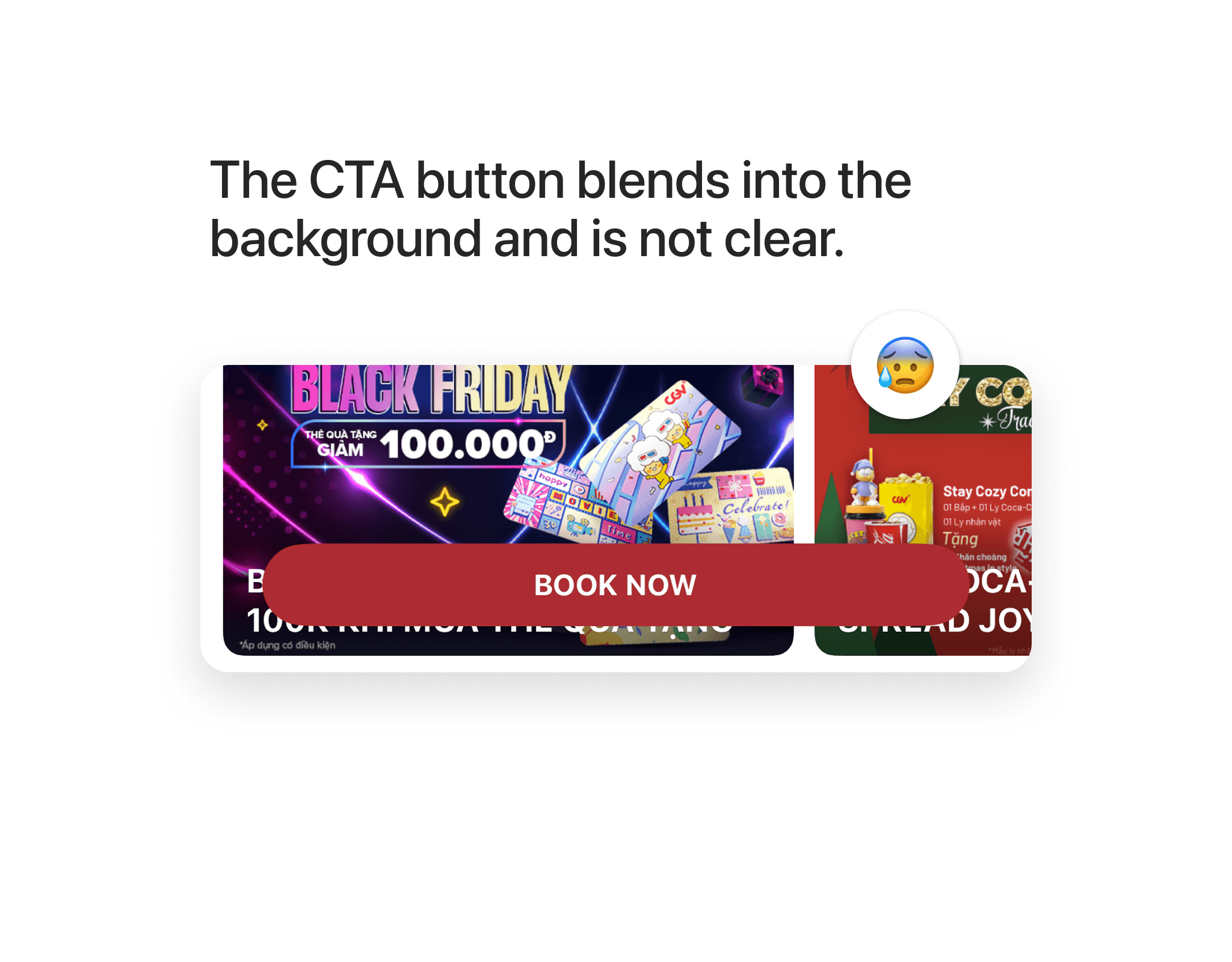
The CTA button here lacks an overlay layer to help it stand out against all backgrounds; as you can see, the button is displayed on an advertisement banner, causing it to blend into the background and be hard to notice.
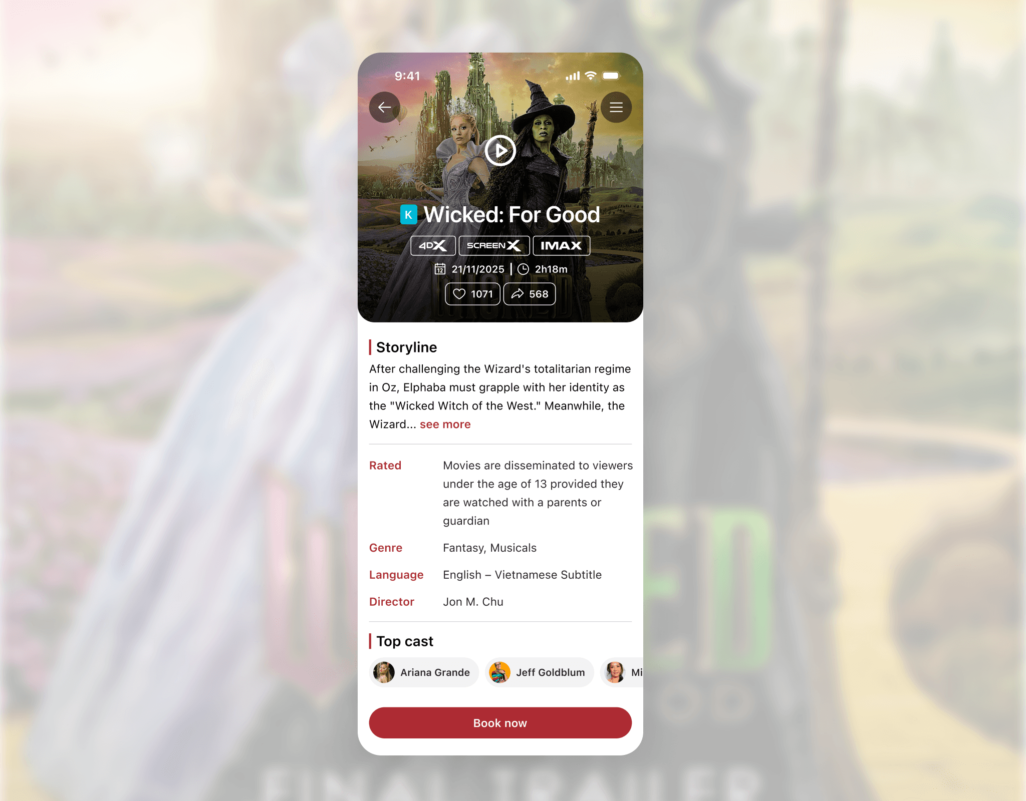
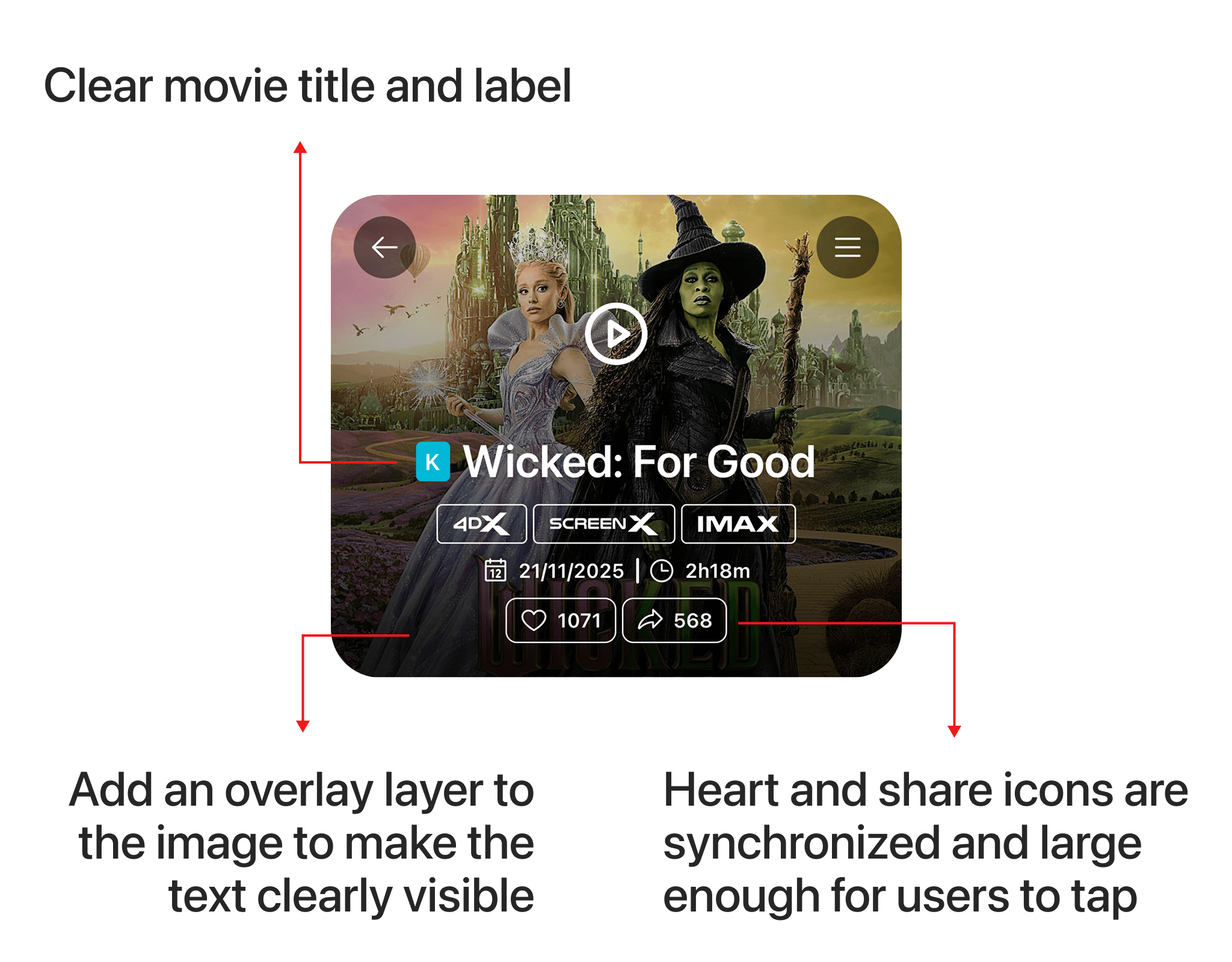
Below is the new design; the movie label and title have been enlarged and made more prominent, and the like and share icons have been synchronized and are large enough for users to tap easily. Below the text, I placed a black gradient overlay to ensure the content is clearly displayed on any image, whether bright or dark.
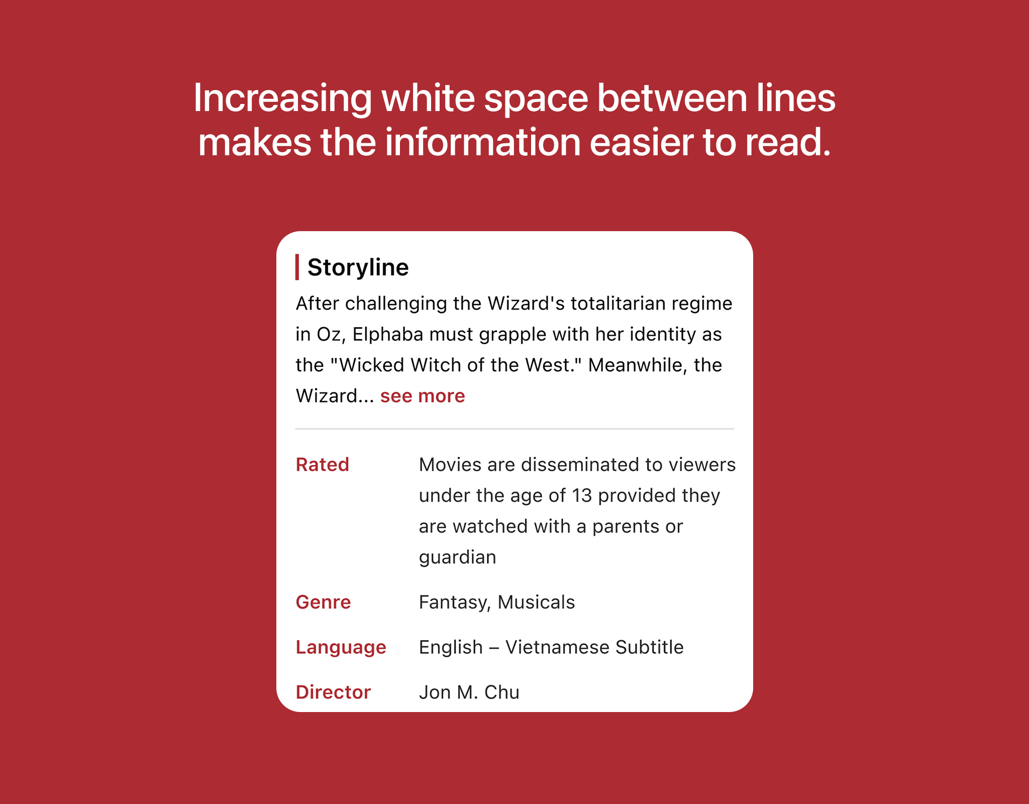
In the detailed movie information section, I increased the spacing between lines to reduce reading pressure on users, while also adding dividers to clearly separate the content.
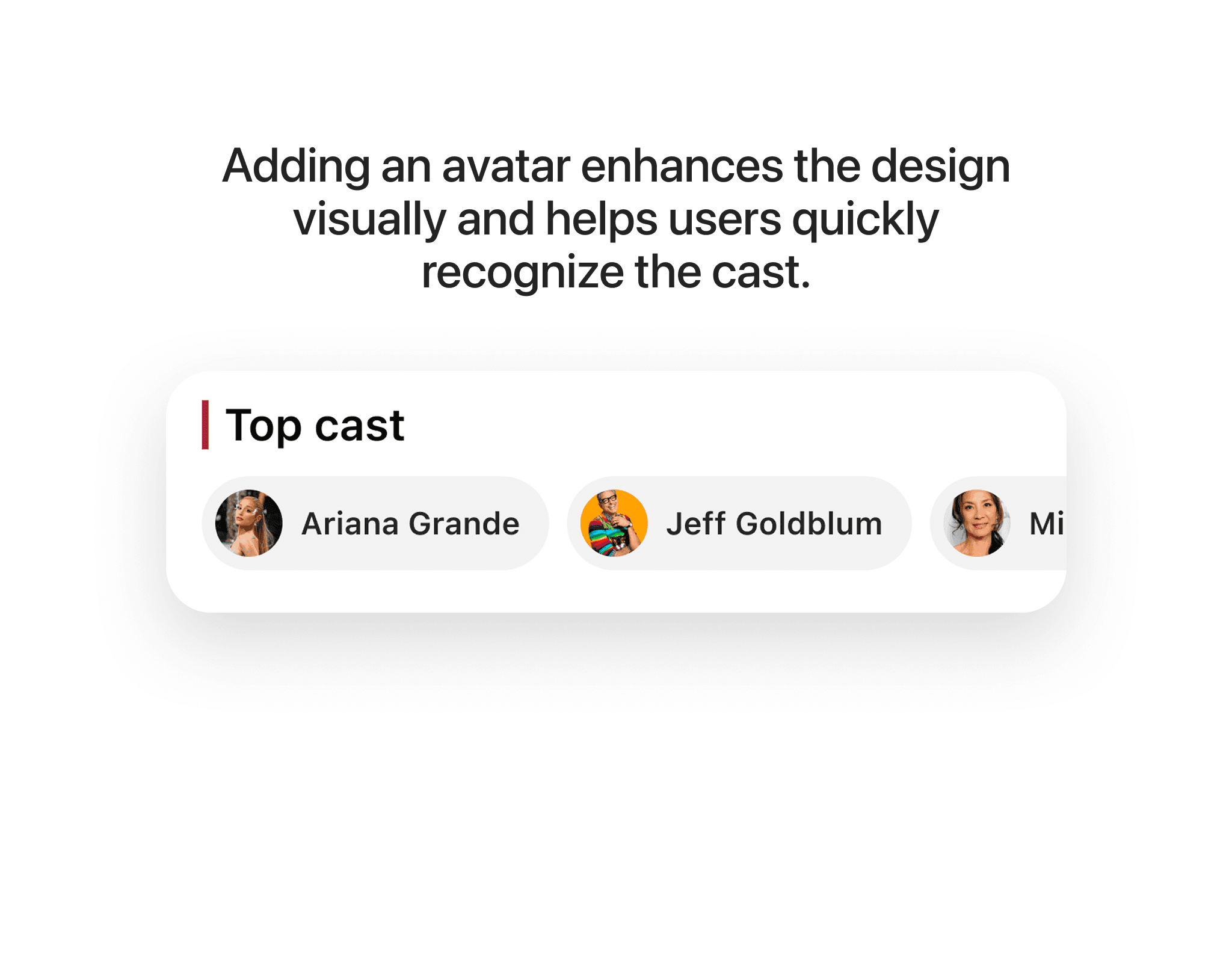
In the top cast section, I added avatars of the main actors to make the design more visual and enhance user recognition. Here, I used a horizontal carousel layout for the main actors, optimizing display space and preventing users from having to scroll too much.
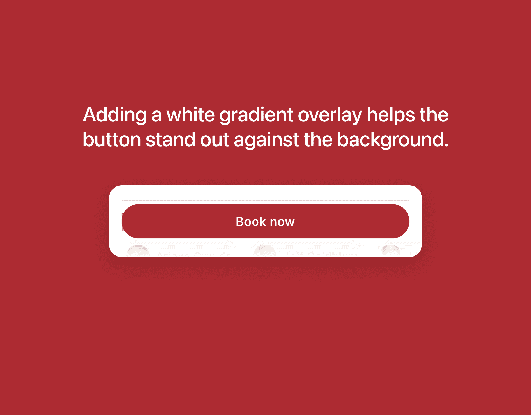
I added a white gradient layer (0% - 100%) beneath the CTA Button, which helps the button stand out clearly against any background, whether bright or dark.
Below is the complete design of the movie detail screen. In this new design, users will find it easy to read the movie information, and the like and share icons are clear and synchronized, making it comfortable for users to tap. The CTA Button has been highlighted thanks to the white overlay.